🚀 My Impact
Overview of performance and learnings for the CNT RCAs Tentpole. Tuesday 4 October - Tuesday 18 October 2022
• Strong engagement across all RCA content with Time Spent +47% YoY
• Driven heavily by traffic increase in Social +34% YoY and Email +67% YoY
• Very positive Commission growth YoY, due in large part to Expedia, +166% Overall Commission Revenue at a value of $56,145
• New RCAs Landing Page provided +19% YoY UVs and +62% YoY Time Spent
Background
The challenge was to leverage a massive design system and CNT brand identity, while building and releasing the MVP for the Readers’ Choice Awards 2022 (USA) bundle page. This involved addressing gaps in the previous experience from commercial, product, and UX perspectives and exploring AI tools to automate processes.
The Challenge
We aimed to understand user motivations for the landing page while introducing new product cards with bookmarking. Managed by CMS (Copilot), the challenge was balancing user needs with the product's short- and long-term commercial vision.
Role
Lead Freelance Product Designer.
I led the Reader's Choice Awards 2022 Epic bundle page, and the Venue product cards from a UX strategy (tactic and strategic) and product design standpoint. I led the whole cycle from the discovery to the delivery phase to understand the users' motivations for this bundle page. Enhancing user engagement, retention and optimisation.
• Product Designer
• User Experience (UX) Designer
• Interaction (IxD) Designer
• User Interface (UI) Designer
• Visual Designer
Deliverables
• UX strategy
• Empathy map
• Analysis 2022 RCAs Bundle Page
• Audit 2022 RCAs Bundle Page
• Card Sorting categories
• Card Sorting content product card
• Survey user motivations on-site
• New product cards across site
• New components of the Design system
• Design Tokens
• Wireframes
• Prototype
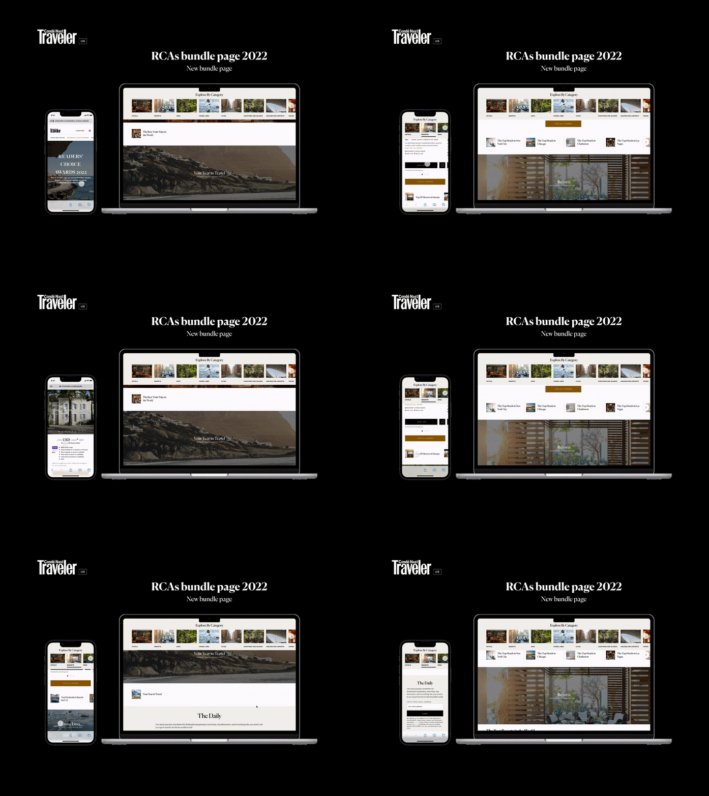
• New RCAs bundle page
• A/B test
• Documentation
Tools
Figma, Miro AI, Hotjar, Optimizely, Usertesting.com, Typeform, ChatGPT, Jira.
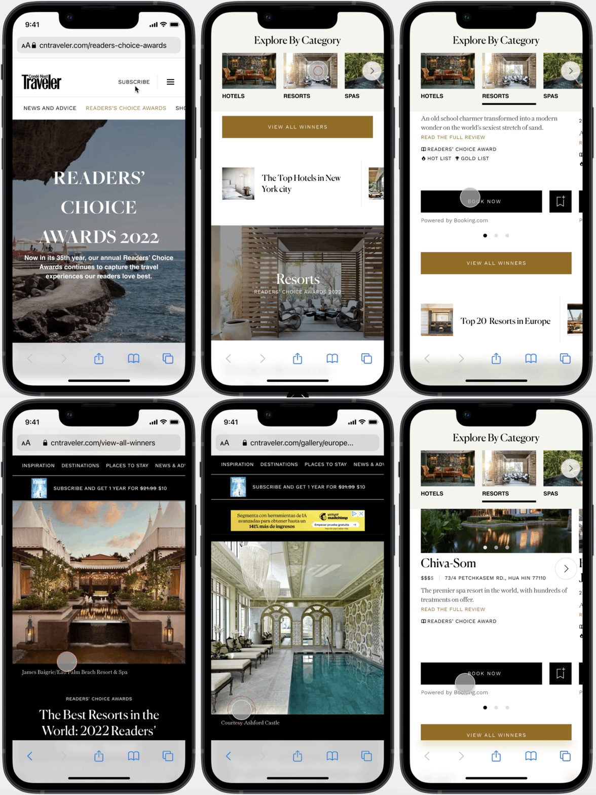
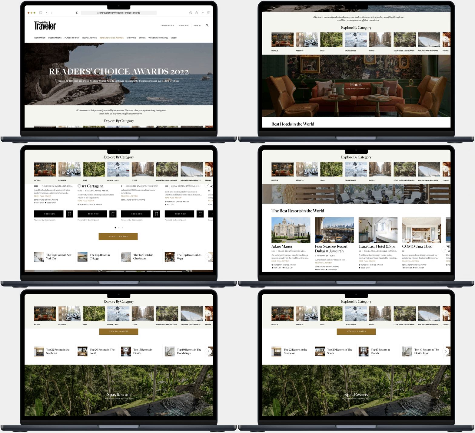
Final UI
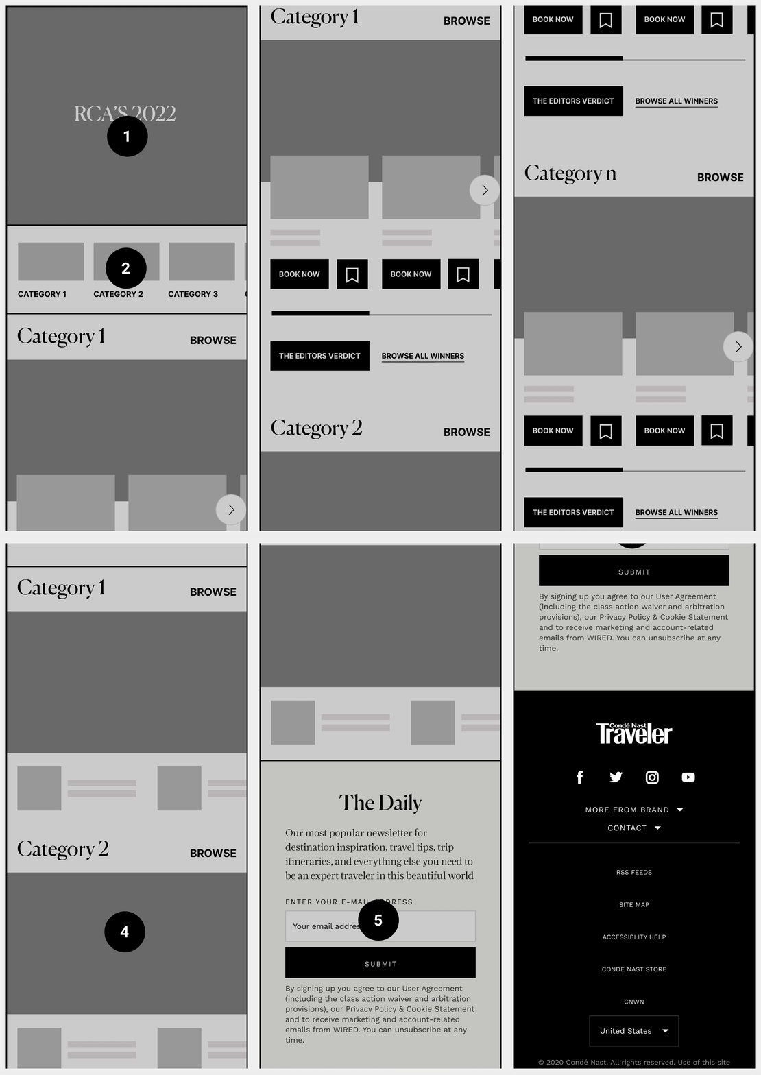
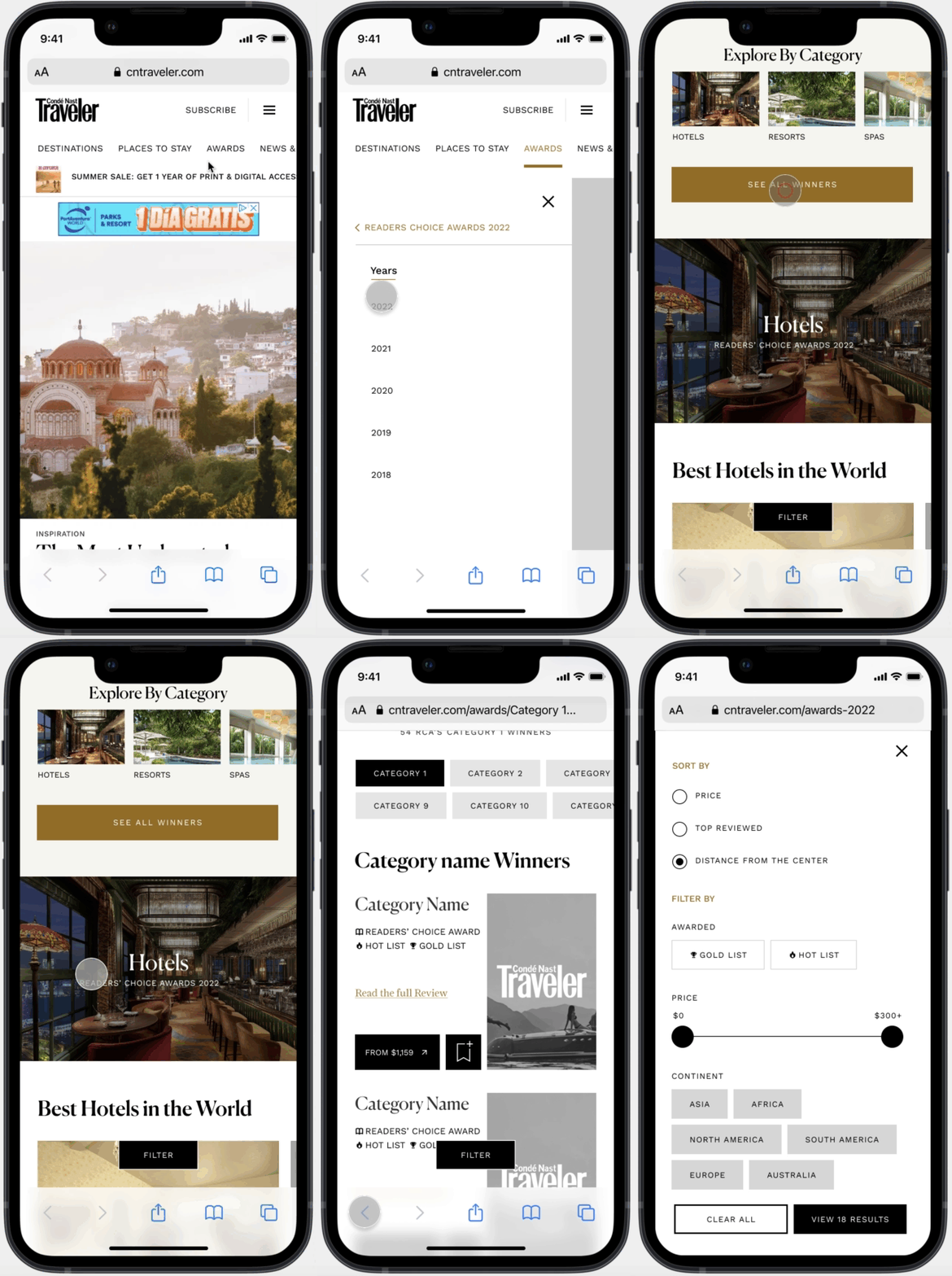
Overall, the new RCAs Bundle page and new Product cards are aligned with “Verso” Design System and Design Tokens and precisely with CNT Brand Identity. We have added a new CNT product card in the storybook and the whole content has been built in copilot CMS.
✅ UX Strategy
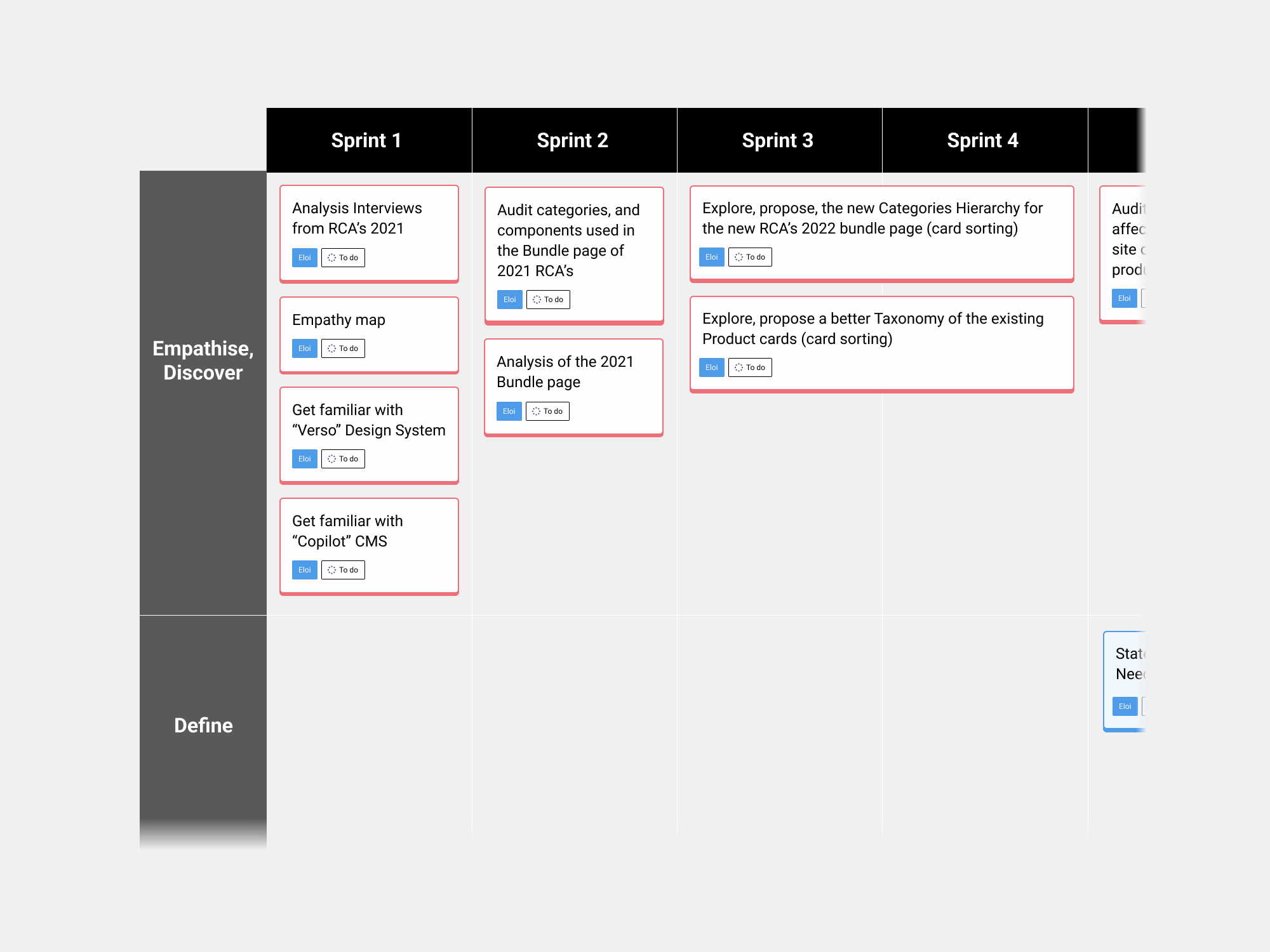
I collaborated with the Product Manager and Tech Lead to define the UX strategy, aligning it with business goals set by the Project Manager and Product Director. Based on user insights from 2021, we set 2022 goals focused on acquisition, lead generation, and retention. With the RCA bundle page strategy in place, we outlined UX initiatives, a five-month plan, and a long-term vision for 2023, ensuring flexibility to meet OKRs.
Dependencies:
• Existing / reuse capabilities - Copilot component for countdown clock
• Campaigns are planned for the different tentpoles in the Allure universe - Best of Beauty Awards (Explore, from an engineering and design standpoint, what we can reuse.)
✅ Empathise
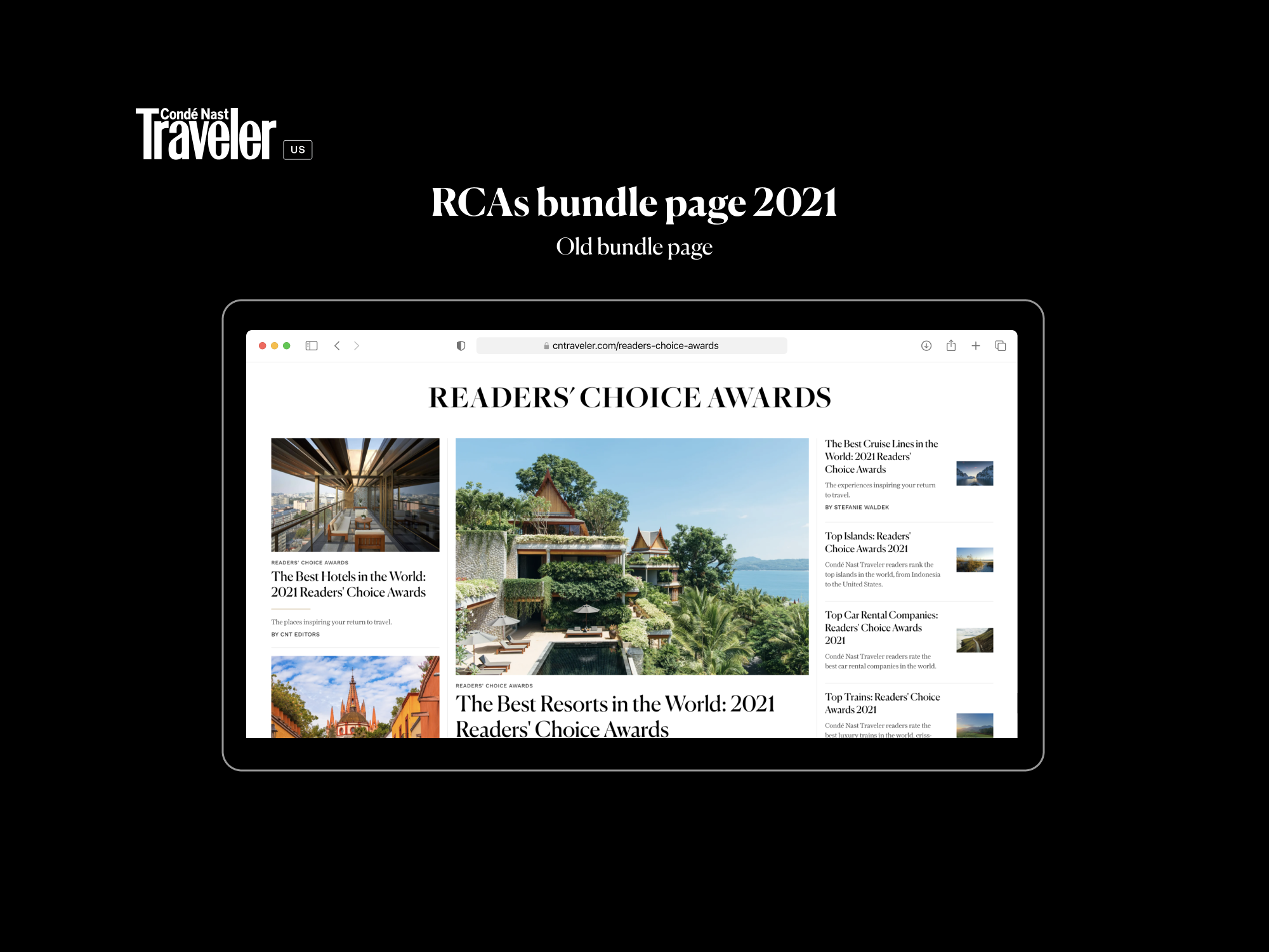
• Analysis old bundle page: I analysed the bundle page; just from a UX standpoint, I didn’t have any information or insights about the users, just pure analysis.
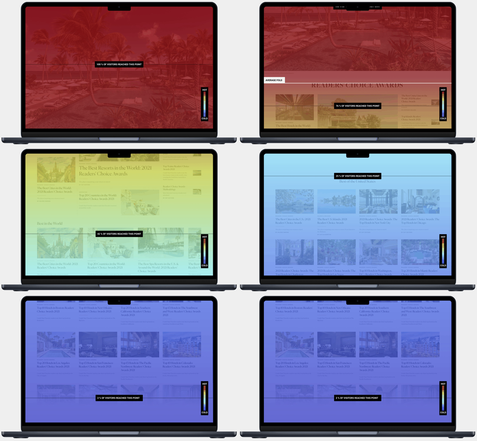
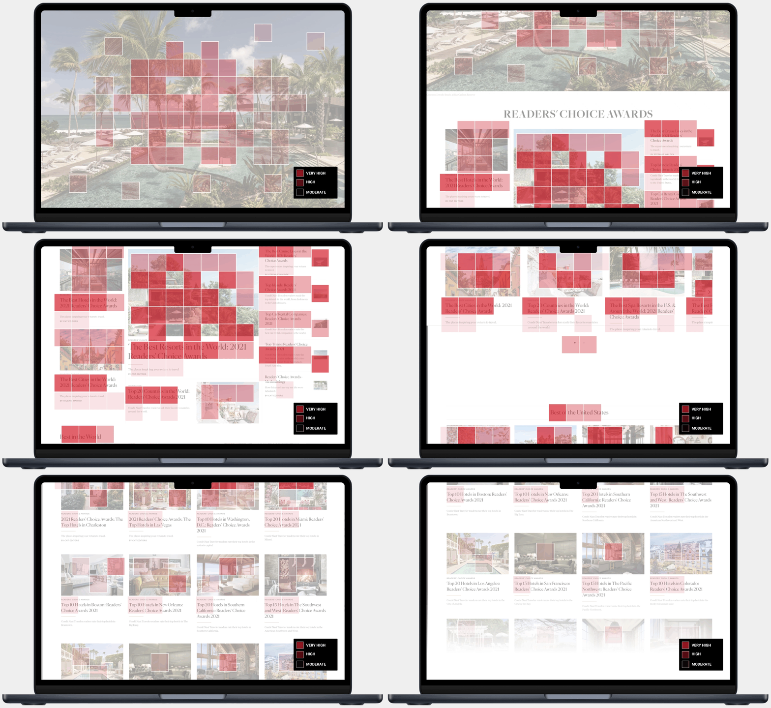
• Hotjar insights: Behavior analytics showed users rarely reached the second half of the page due to excessive content and a large header image. Poor content grouping led to inconsistent engagement, especially on mobile.
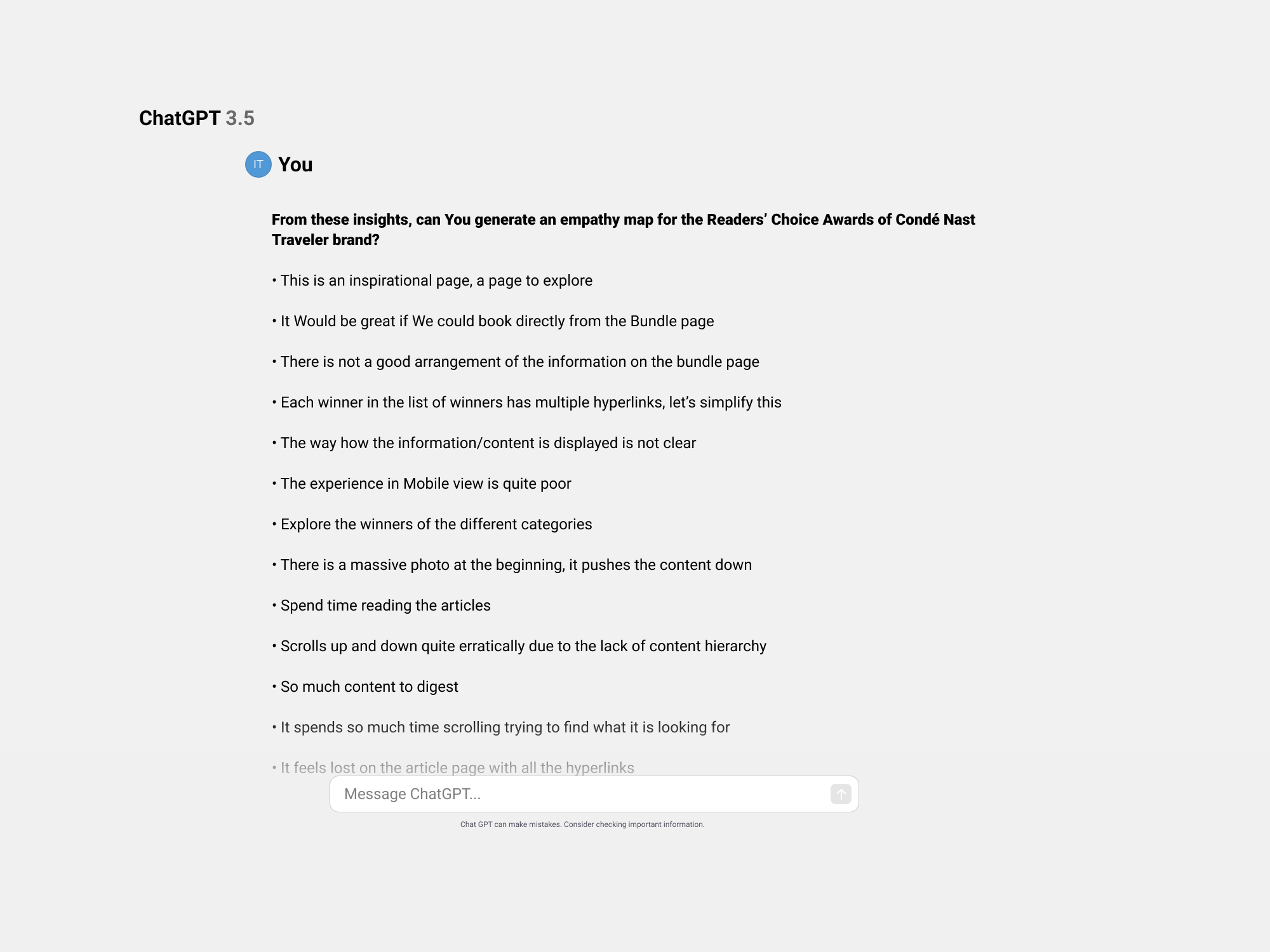
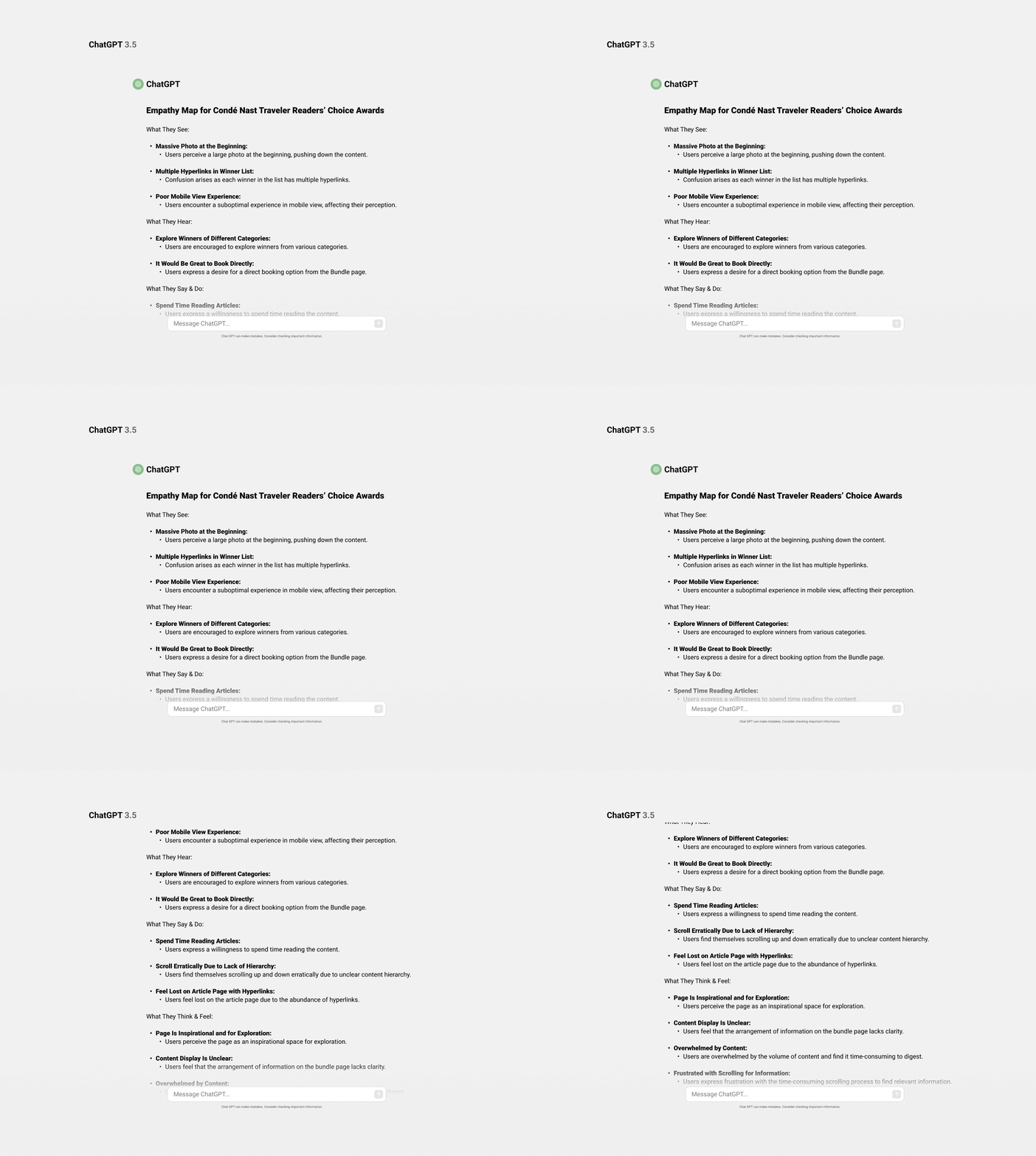
• Empathy map using AI: We had relevant user insights from user interviews from the 2021 bundle page, an example of how We could speed up this process is leveraging ChatGPT to create an empathy map, and prompt…
• Miro AI assist: After automating the empathy map with ChatGPT and verifying its accuracy, we can paste it into AI Miro to generate structured sticky notes by prompting: “Can you generate sticky notes while maintaining the same structure?”
• Audit categories RCAs Bundle page : I conducted an audit of the bundle page, examining the number of categories, flows, and variations. The goal was to understand what went wrong in the previous years, identify potential changes, and start to devise ideas based on this information.
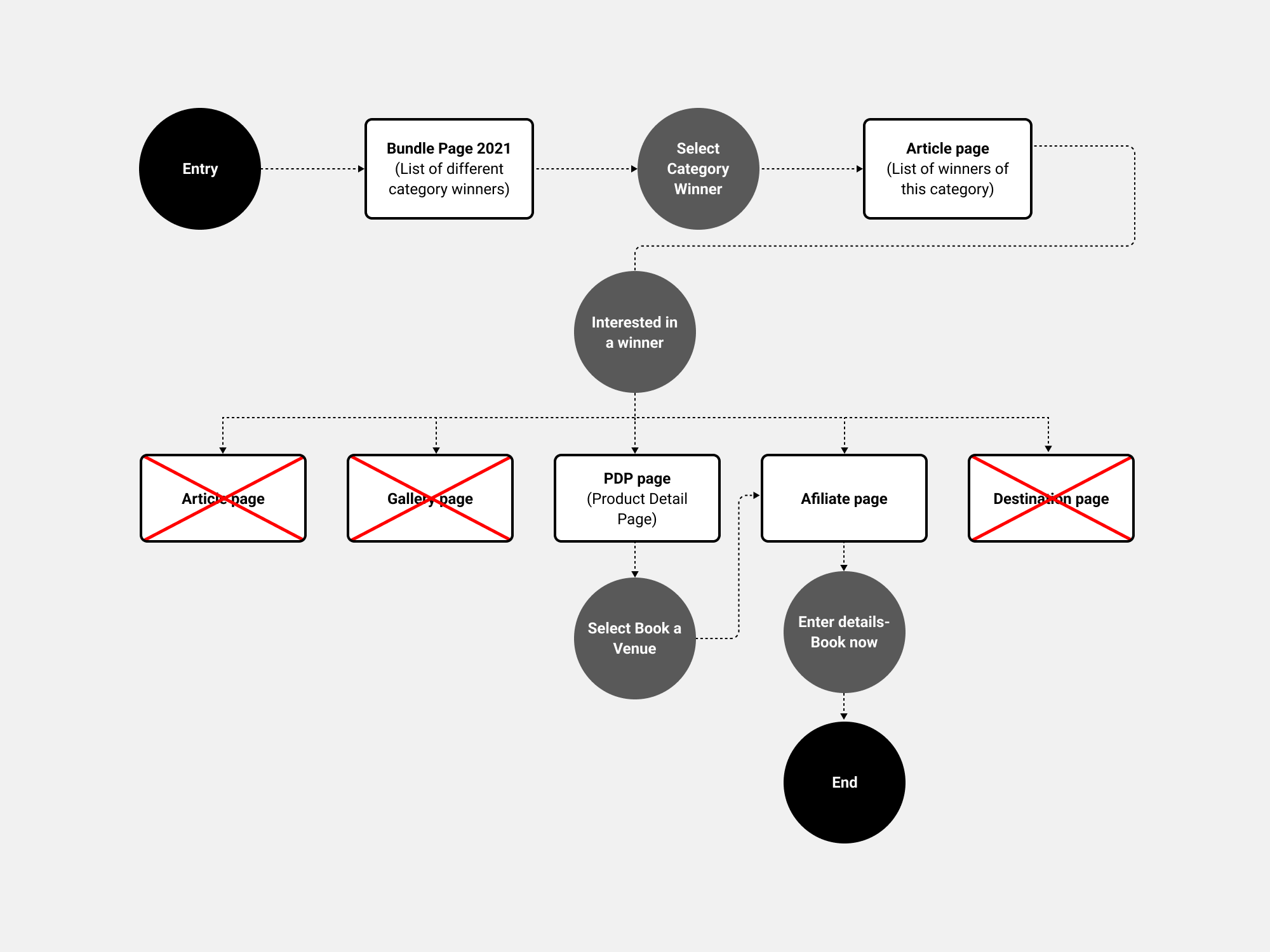
• User flow analysis: The user journey is inconsistent, with navigation to various pages causing drop-offs. To keep users in the funnel, I collaborated with the editorial team to optimise the flow and prevent redirections to irrelevant pages.
Data from 2021: This data, Focusing on page UVs and revenue should be approached cautiously due to limited testing and analysis last year. To address this, we’ll run a card sorting experiment to identify key categories, align with business goals, and assess commercial and editorial impacts.
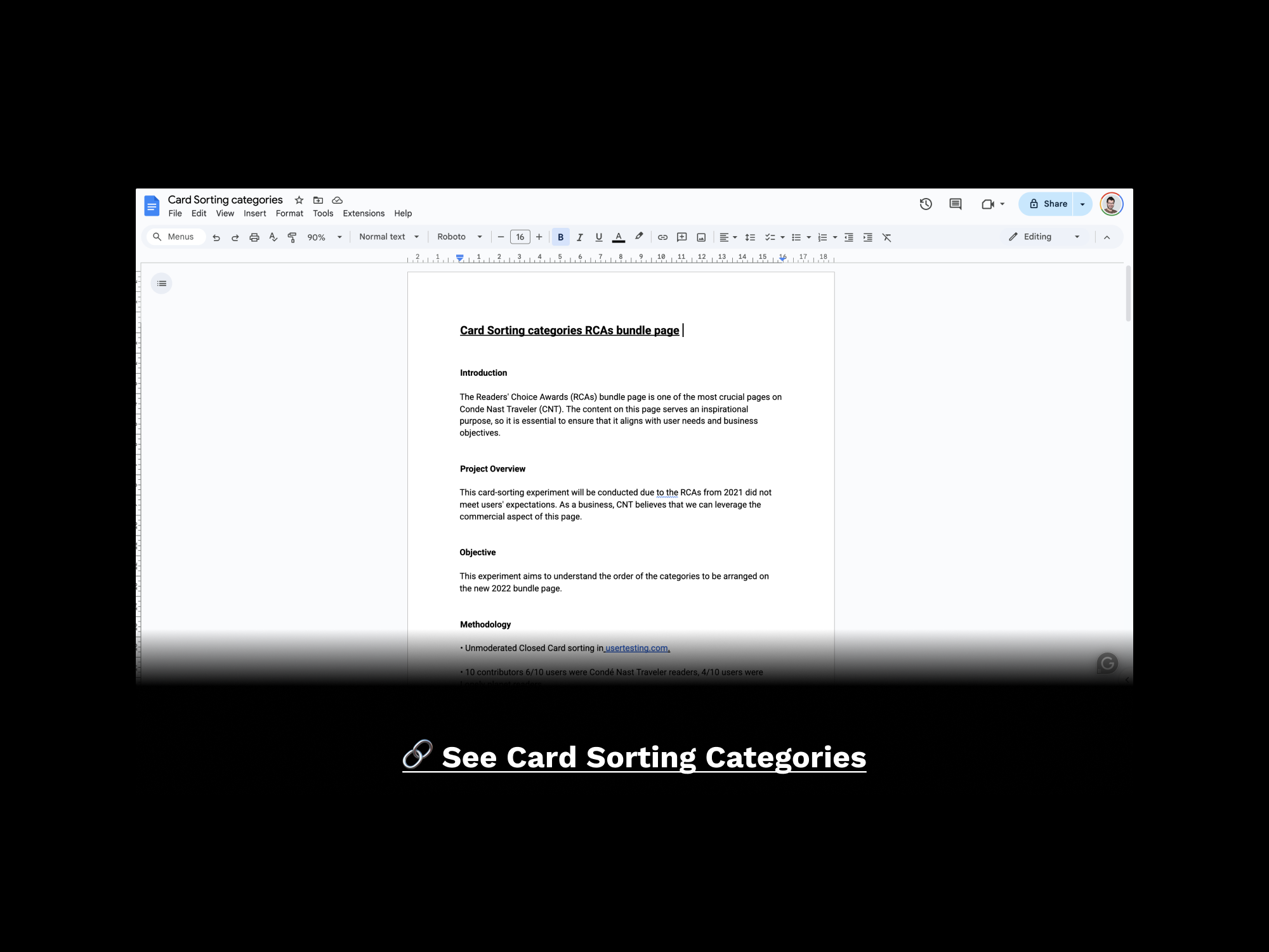
• Card Sorting Hierarchy of the Categories: I conducted a card sorting test on usertesting.com to determine which categories were more significant to the users and to strike a balance with the commercial goals for this page.
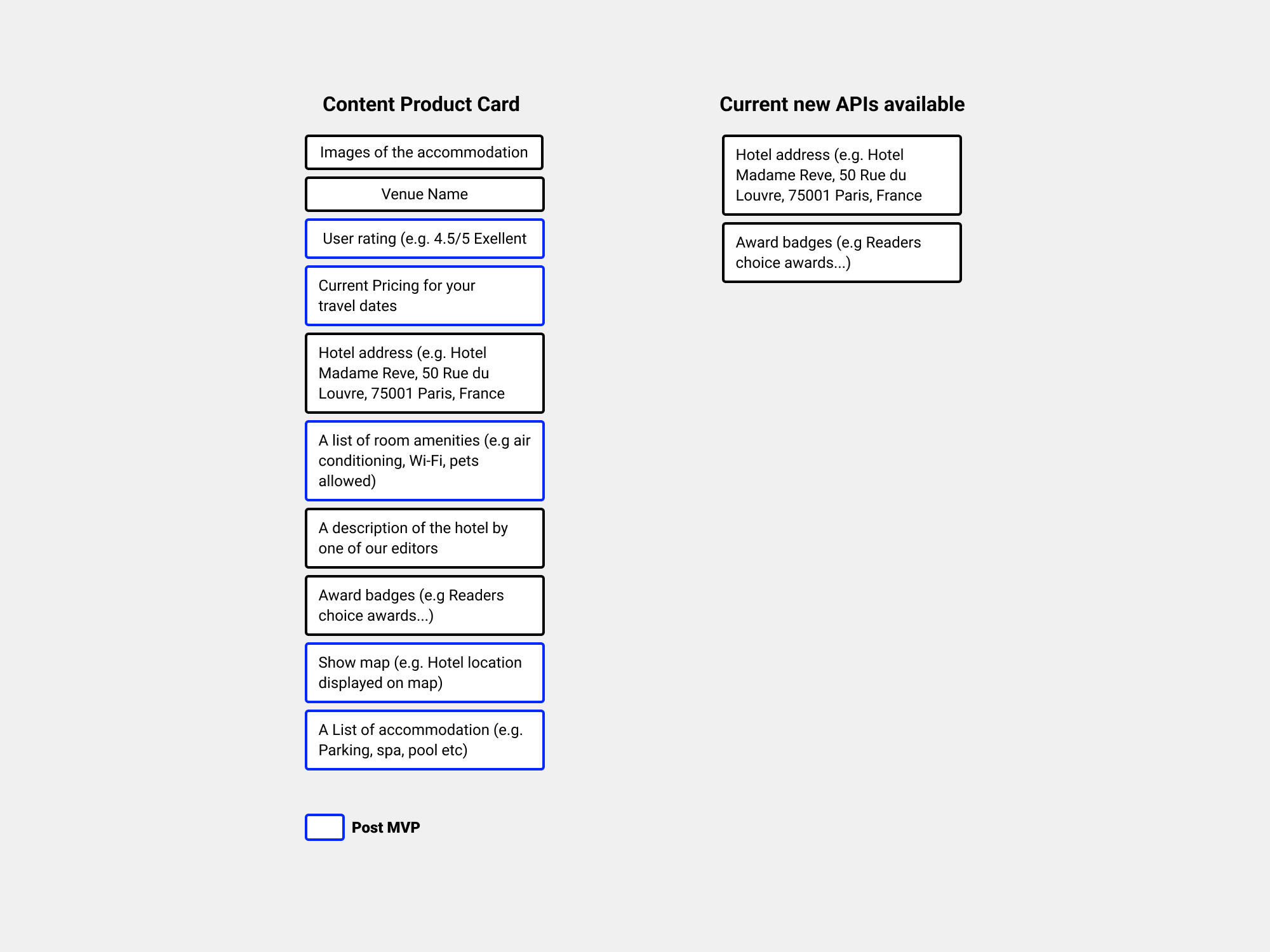
• Card Sorting filters and content Product Cards: I conducted a card sorting experiment to optimise product card details/content, considering missing post-MVP APIs for accuracy. Additionally, I explored user motivations in accommodation filtering, addressing low survey traffic due to incentives, timing, and technical issues.
• Survey filters and user motivations: The business aimed to comprehend user motivations while on the site. It sought to identify the most useful filters for users when refining search results. The findings will be implemented in 2023 when We have APIs filters in place.
✅ Define
User: Global audience and Condé Nast Traveler user exploring Readers’ choice Awards.
Needs: Navigate across categories, explore the best 2022 “Categories” and “save” and book a venue.
Insights: The users were frustrated with the bundle page's arrangement and access to the content.
✅ Ideate
We had relevant data and results from all the research phase. As the release strategy involved launching the product cards first, followed by the RCA bundle page, I began designing the new product cards.
• Product Card: Let’s analyse what We have in the current Product Card
Let’s narrow down what we need for the new product cards, MVP content, and current new APIs available.
The Design System team developed a Figma plugin called 'Swap BI.' With this tool, all the agnostic and brandless components switched to the selected BI, causing the Type tokens and colour tokens to also change accordingly.
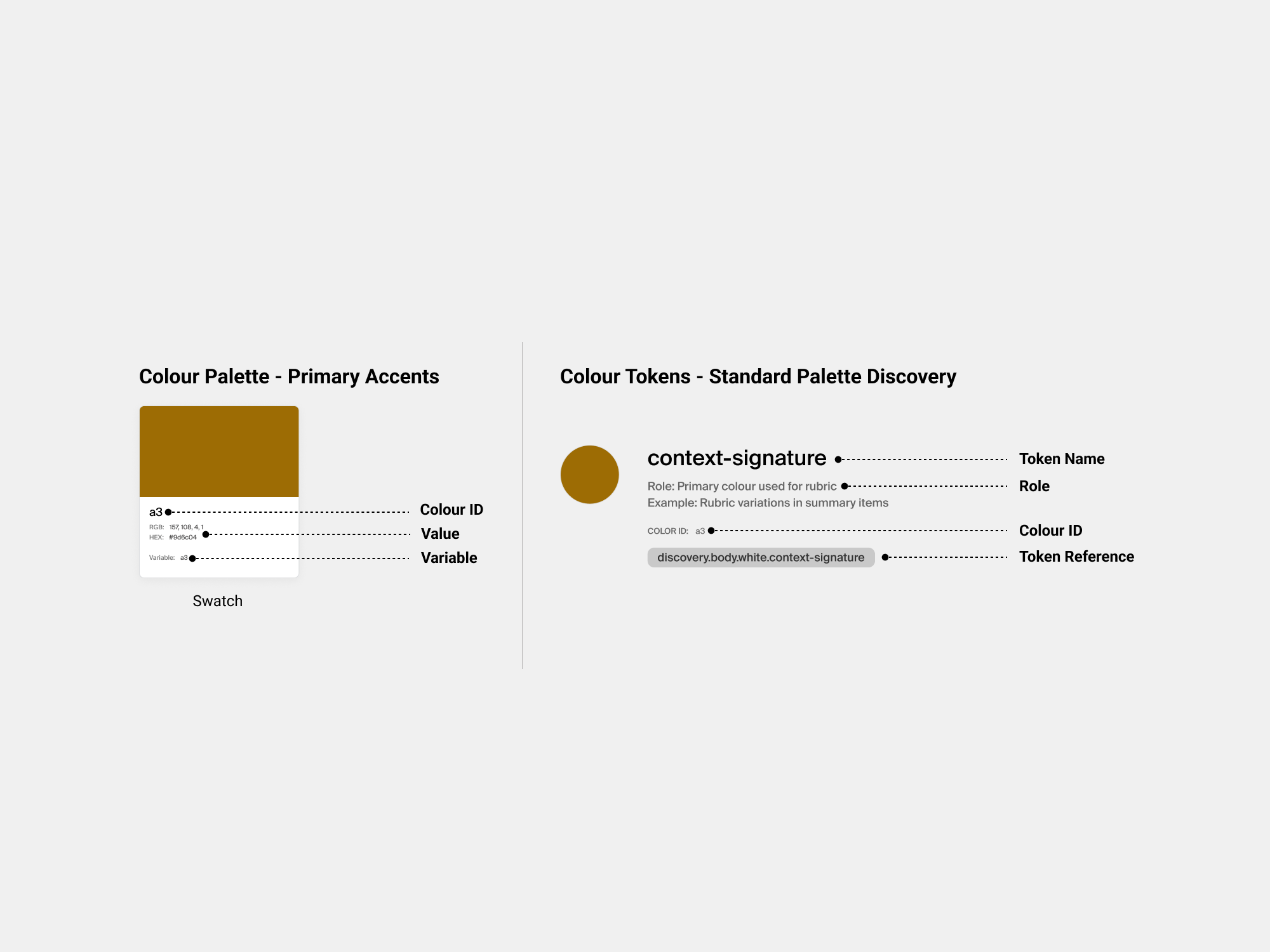
So, how does it work the CNT Brand Identity ?and how does that connect to the “Verso” Design System?
Each color swatch includes an ID, value, and variable. Adjusting the value updates the corresponding token automatically. For CNT, the token reference remains consistent across all brands (Vanity Fair, The New Yorker, Vogue, GQ). Understanding token roles was essential for proper application.
The same goes for the Type Tokens. If You update the brand font, the Type Token will be updated automatically for the CNT Brand.
• I designed new product cards, considering research-driven content, orientation, variations, carousels, and endpoint impact. Since the design system was already WCAG-compliant, I focused on creating a CNT-specific card library as a variation of the brandless ones and we integrated it into the Storybook.
• Bundle page RCAs 2022: After We released the product cards across the site, I started to create the landing page. The data indicated that 80% of the traffic for CNT comes from mobile devices. So, mobile first approach, I began outlining the architecture for the bundle page and initial thoughts.
• Content Strategy and SEO optimisation: I collaborated with the UX copywriter to boost brand loyalty, attract a global audience, and position RCAs as a top travel resource. We optimised content for travel enthusiasts, enhancing organic traffic through keyword strategy, relevant content, SEO-friendly titles, internal links, and image optimisation.
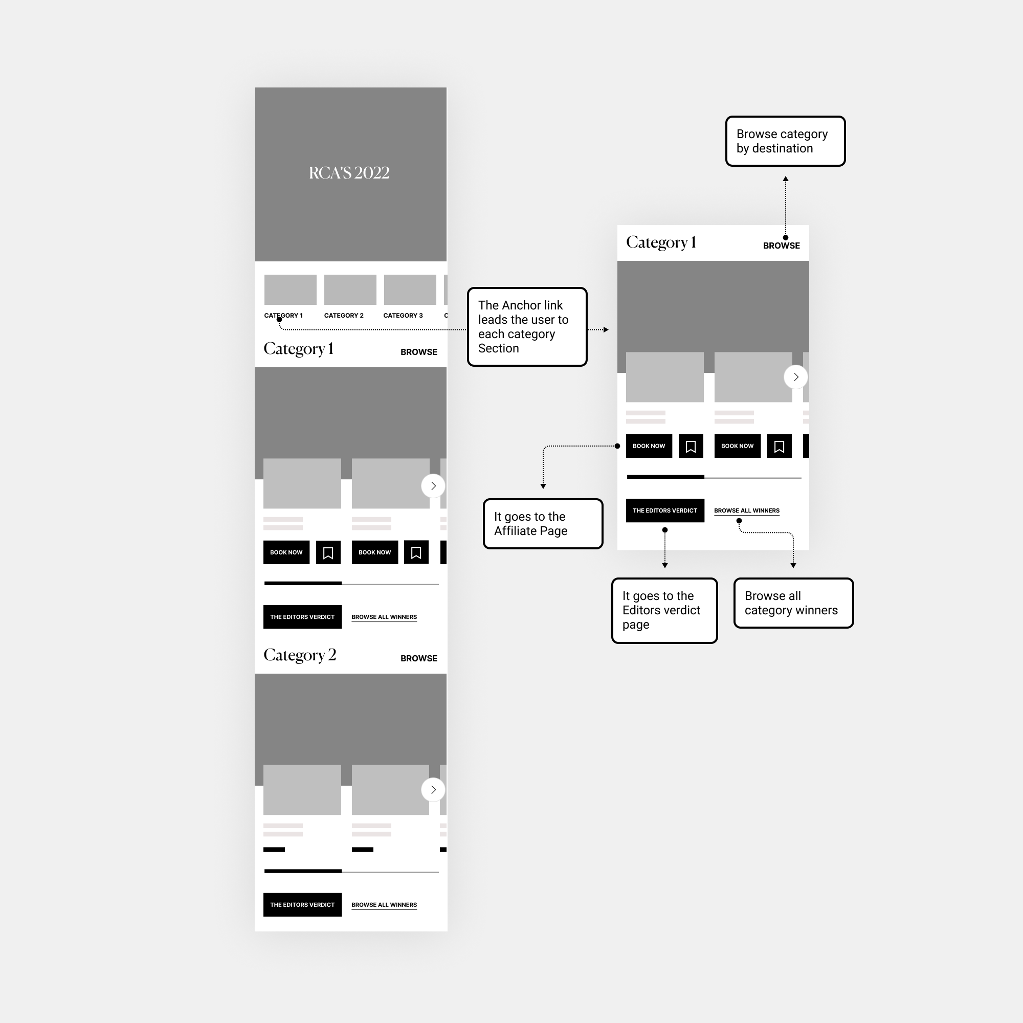
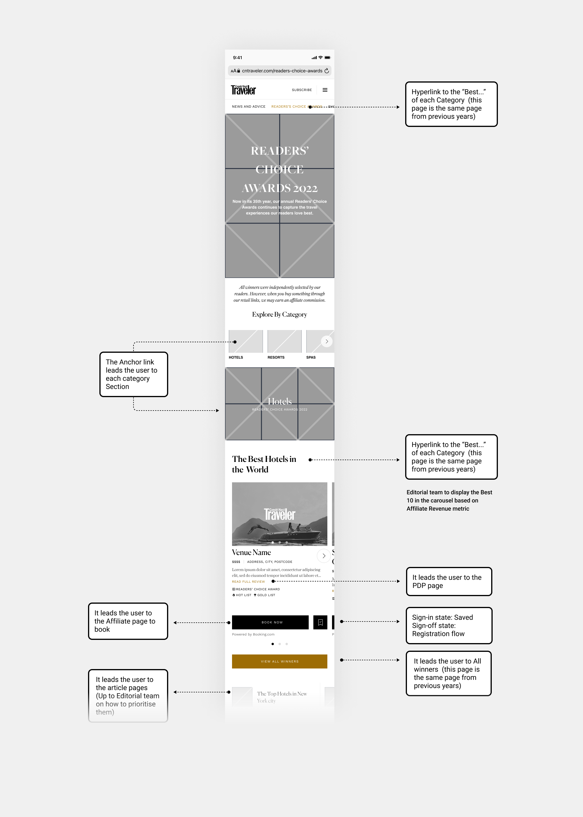
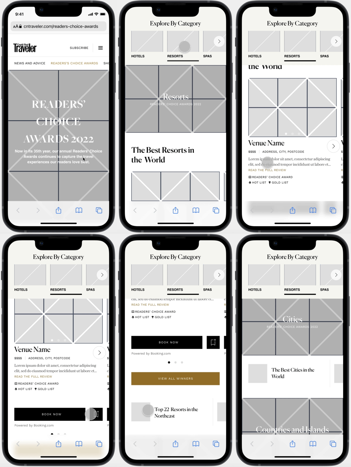
• I started the process with low-fidelity wireframes to gather initial feedback from key stakeholders and the product team.
-
• "The Editors Verdict" is not part of Condé Nast Traveler, so We won't have that.
• "Browse" what? We need to be content-specific.
• "Browse all Winners" deserves to be more prominent.
• Visual in-page component from Allure works here, anchor link to each category, let's reuse it.
• The CNT product cards don't have the slider at the bottom.
• From a navigation and experience perspective, it makes sense.
Iteration 1
-
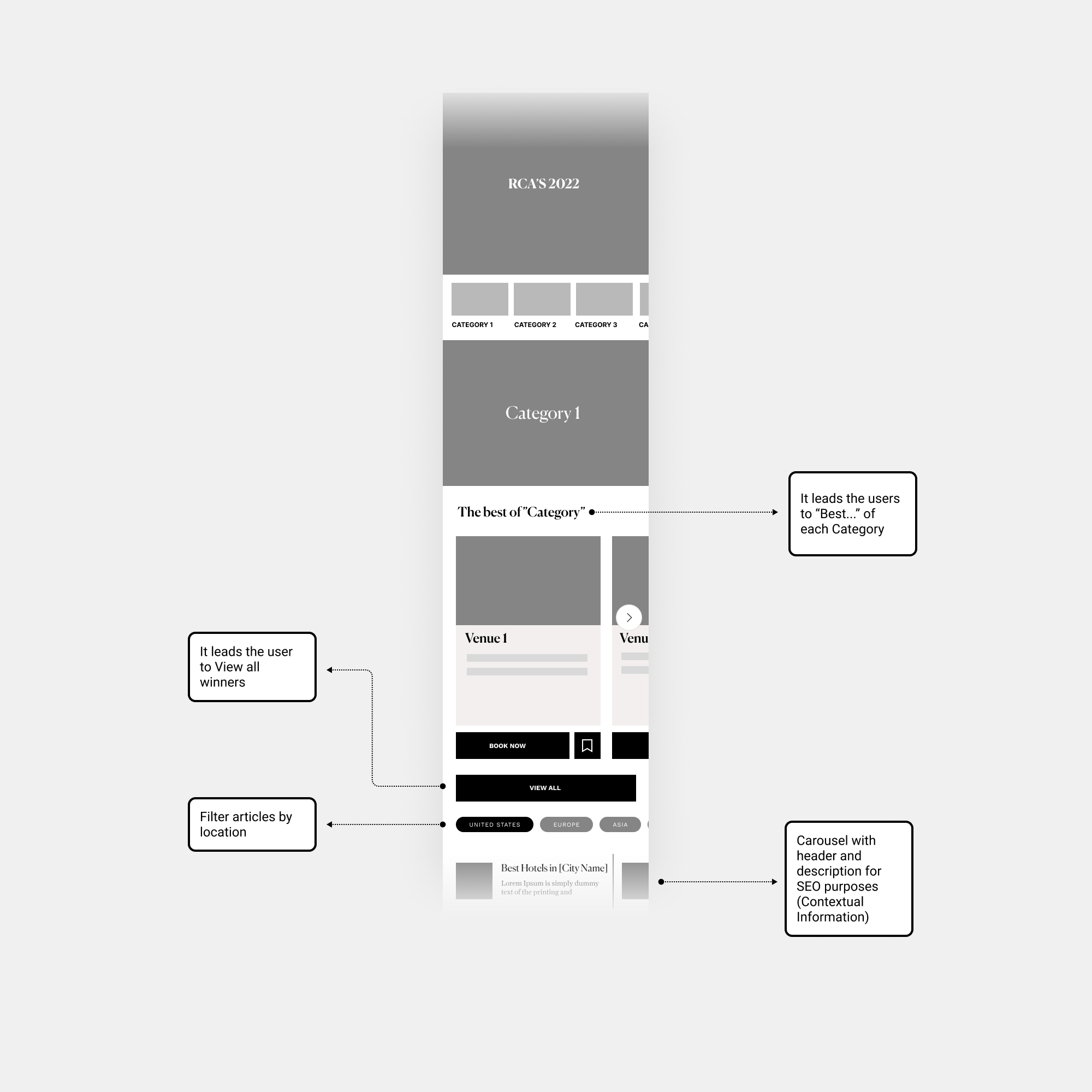
• Since we are using the “Bundle Header” component across different parts of the site, let’s reuse the same to maintain consistency.
• We need an intro to contextualise the user, and at the same time, it will be much better for SEO optimisation.
• “View all Winners” instead of “View all”.
• No need to have the ability to filter the articles by location, We don't have this component built-in Verso Design System, so let's keep it simple.
• It’s worth building a new component allowing users to visit the article page. Having a Header and description is excellent for SEO purposes, but let’s keep just the Header; the description on each article in this small place can be irrelevant in many cases.
Iteration 2
-
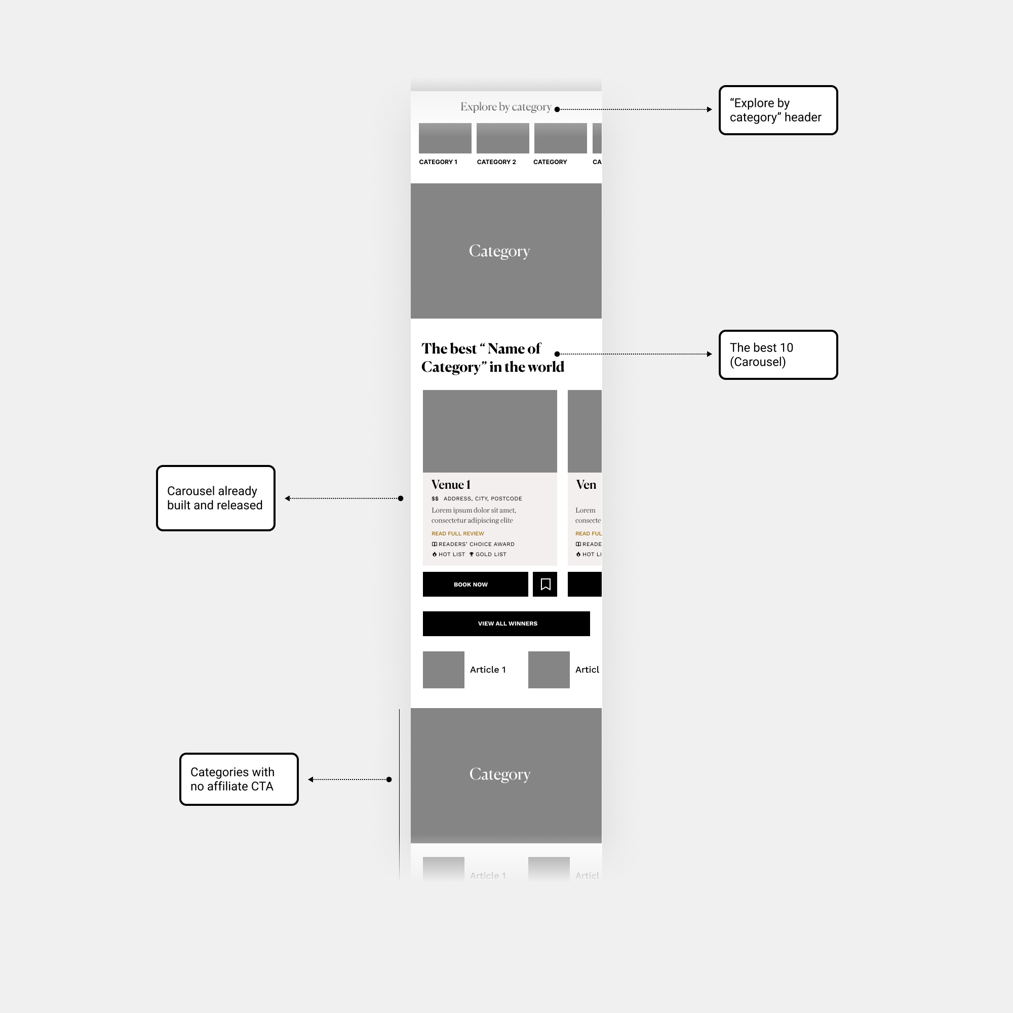
• Let’s add the disclaimer.
• Let’s change the intro for RCAs, let’s create relevant content.
• We need to see how they look the categories with no affiliate CTA.
• Let’s place the product cards component carousel.
• We need a title for the anchor link component “Explore by Category”.
• Better to say…The Best “Name of Category” in the world.
Iteration 3
So, here are the components We use from the Design system. We had a Core library with all the aspect ratios, Grid, Spacing Base-8, and assets. So, We had these components below to start to create the Bundle page, We reuse the visual in-page navigation from the Allure brand, and the product cards We had already built.
• Copilot CMS: Apart from managing Content creation, including text, images, videos, and more… We added the Event banner “Countdown Clock” that We used in different brands to drive anticipation, awareness, and excitement before RCA content launch.
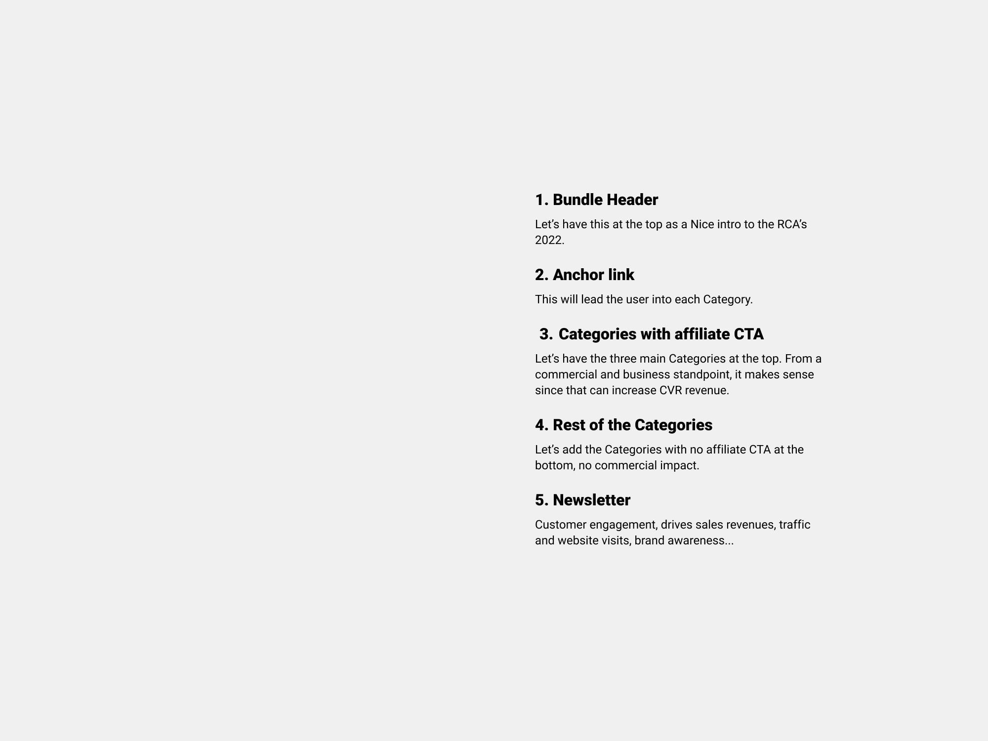
• So, what is the outcome? Following the results of the card sorting and the careful consideration of business, editorial, and commercial priorities, the sequence of categories is as follows: Hotels, Resorts, Spa Resorts, Your Year in Travel, Cruise Lines, Countries, Cities, Trains, Airlines and Airports, Islands, and Ski Resorts.
✅ Prototype and test
• We launched the Readers' Choice Awards 2022 and closely monitored user interactions on the landing page to evaluate its effectiveness as a source of inspiration. We analysed whether the page increased time spent, unique visitors, and drove higher commission growth.
• Documentation for the MVP: I supplied the bundle page, visual in-page and visual link banner components documentation. Apart from that, I had design review sessions and QA designs with engineers.
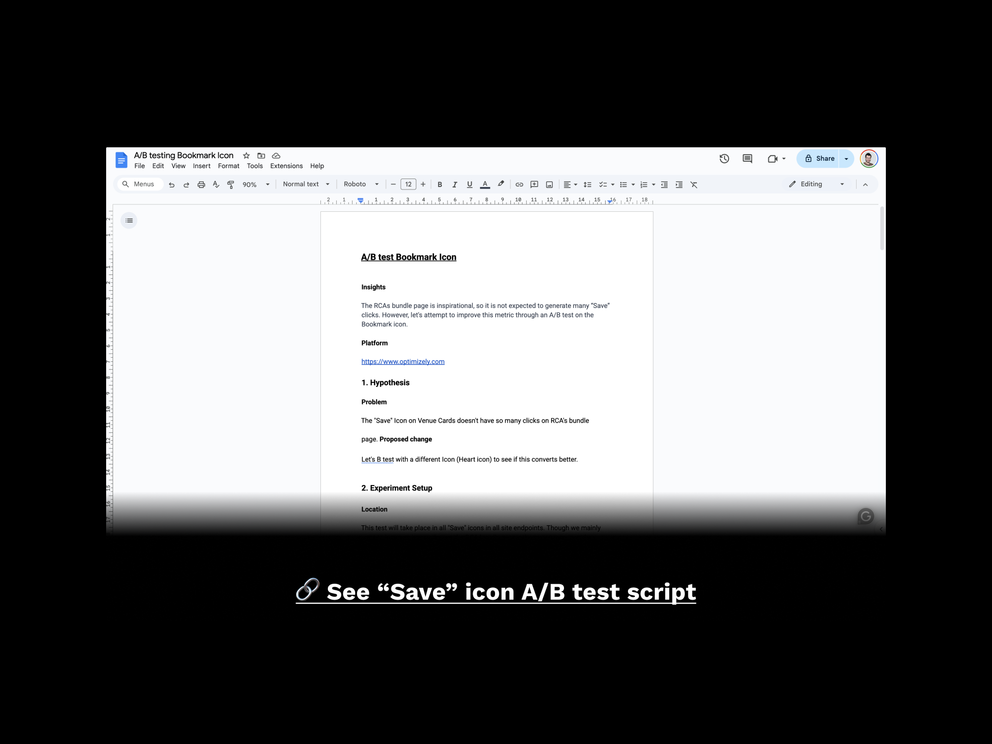
• A/B test: While the RCAs bundle page is designed to be inspirational and exploratory, we observed a low click rate on 'Bookmark' CTA. As a solution, I suggested conducting an A/B test on the 'Bookmark' icon to assess its potential impact on conversion rates.
Strategic Vision for 2023
Initially, we crafted a UX roadmap for the next 5 months (MVP) tactical and the future (2023) strategic, mapping out features for consideration. We will determine the goals for the post-MVP in Q1 2023. They will be based on the insights gained from user feedback, market analysis, and the performance of the initial product release. I presented a prototype approach, pointing out the features and the E2E flow. The board approved this approach.
Lessons Learned
The key lesson from this project is the importance of testing. Although we built the bundle page based on solid research, the absence of real user testing before launch was a missed opportunity. Despite not reinventing the wheel from the previous year's Readers Choice Awards, the new experience proved intuitive and achieved both business and user goals, particularly in revenue. Nonetheless, testing with real users before launch would have been preferable. But, adaptability to timing and resources remains crucial when you are part of the business. The plans for the post-MVP and the A/B test were paused as a result of the business reorganisation and harmonisation for 2023.

