
🚀 My Impact
• Registration Conversion Rate (CVR):
Successfully implemented an A/B test, resulting in a noteworthy +3.5% boost in the Registration conversion rate. This indicates enhanced efficacy in both attracting and converting users during the sign-up process.
• Login Sessions:
Successfully increased login sessions by +30% through the implementation of an A/B test, demonstrating enhanced user engagement and interaction.
• Explore Screen Traffic:
Recorded a remarkable traffic surge of +150% in the explore screen, attributed to the introduction of new travel services such as Covid-19 and car trawler. This signifies heightened user interest and exploration in the newly added travel offerings.
• Ready 2 Order feature:
Significant achievement with over 250,000 orders processed using the Ready 2 Order, a digital food and drink ordering method.
Awards
🏆 Gold Winner of Priority Pass App redesign at 'London Design Awards' 2020 from Collinsongroup.
Background
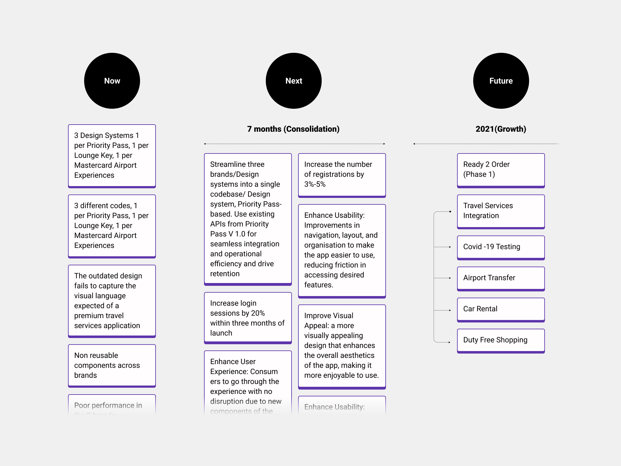
Priority Pass, with 1,000+ lounges and millions of members, launched a Consolidation (Retention) and Growth Project to enhance efficiency and engagement. The initiative streamlined code into a Priority Pass-based system and introduced a new design system with reusable components across brands (Priority Pass, LoungeKey, and MCAE) to improve user experience. Growth efforts included integrating Travel Services for curated experiences and exclusive partnerships, while the Ready 2 Order service enabled seamless on-the-go customisation and ordering.
The Challenge
We aimed to simplify the code and build a Priority Pass-based component set, swapping variables and styles to match each brand’s guidelines (Lounge Key and MCAE). Meanwhile, we ensured the framework remained flexible and scalable to support Travel Services and Ready 2 Order, preparing for future growth.
Role
Lead Freelance Product Designer
I led the UX strategy and the MVP (consolidation) of the Priority Pass app (iOS and Android). In addition, I Ied the user experience and user interface of different travel services, 3rd parties integration. I mentored 1 Junior product designer.
• Product Designer
• User Experience (UX) Designer
• Interaction (IxD) Designer
• User Interface (UI) Designer
• Visual Designer
Deliverables
• UX strategy (with the PM)
• Information Architecture
• User Flow
• Analysis current Design Systems
• Audit current Design Systems
• Creation Design System and colour variables/Tokens - Documentation
• Wireframes
• Usability Test
• UI app
• Prototype
• A/B Test
• Ready-to-Order Experience
• Travel Services Experience
Tools
Sketch, Miro, Invision, Figjam AI (example of how we could speed up the process), Hotjar, Optimizely, Userlytics, Jira.
Final UI
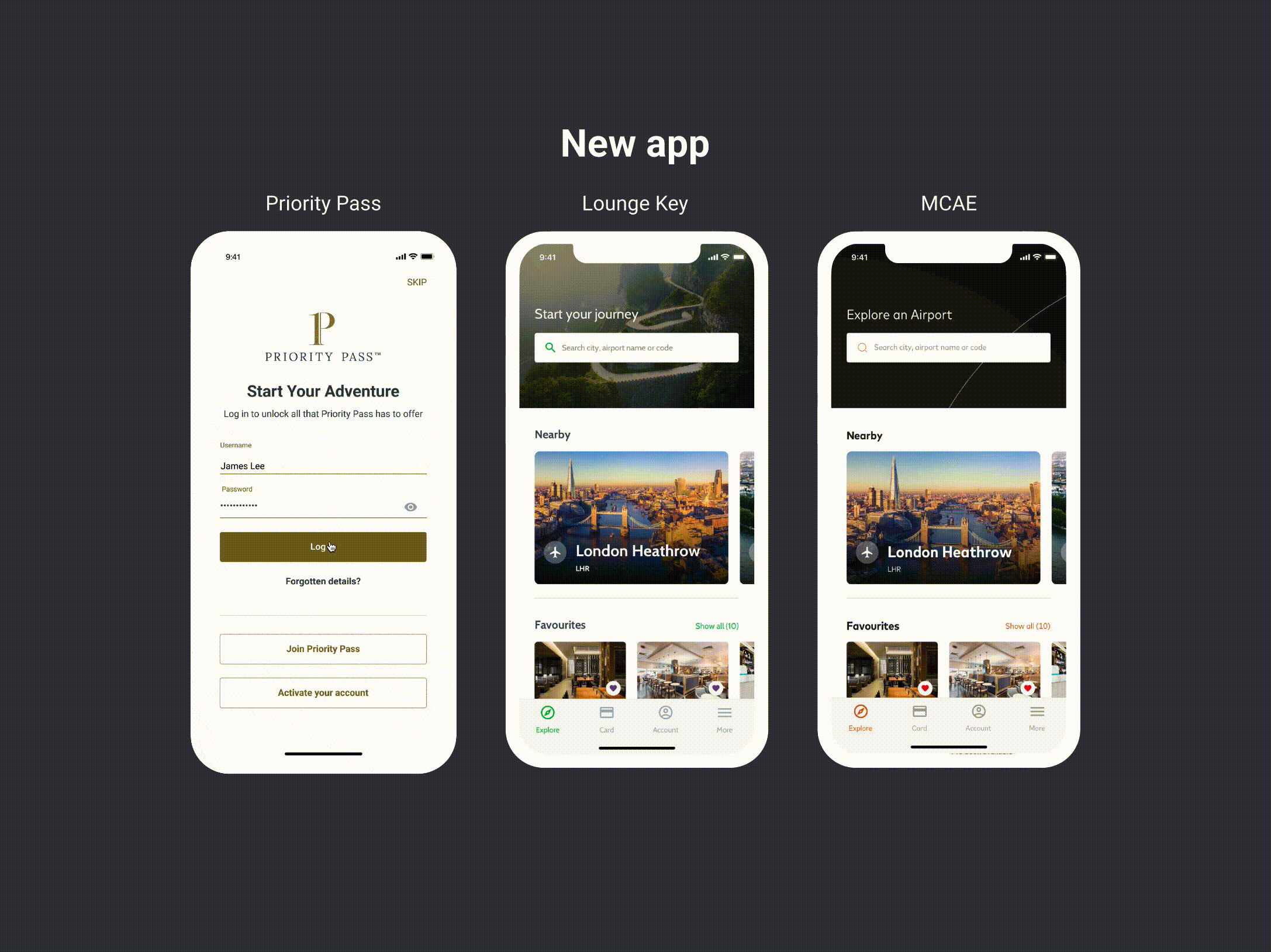
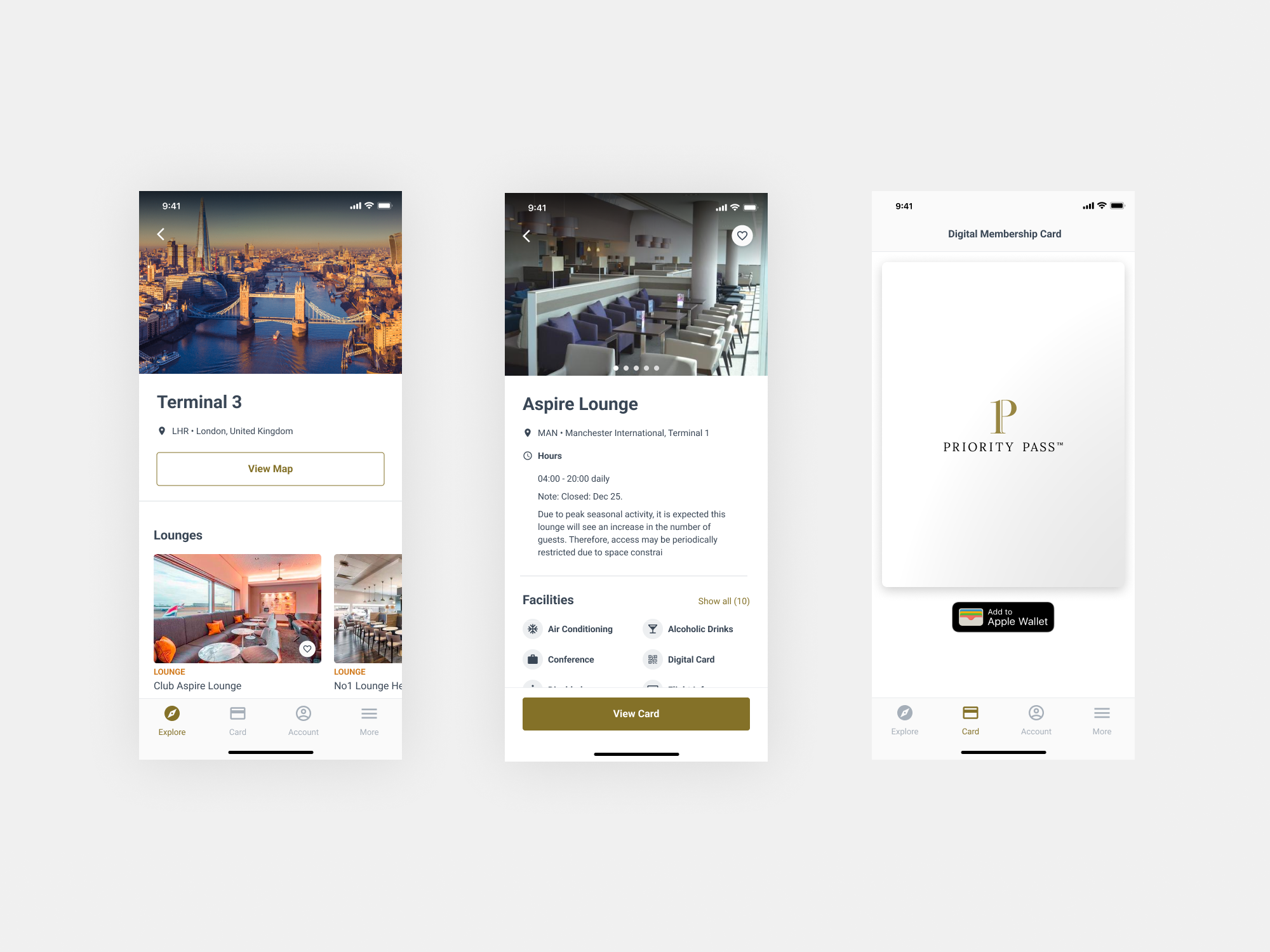
The focus is on creating a modern and cohesive UI design that not only looks and feels up-to-date but also maximises efficiency by using reusable components across the apps (3 brands). At the same time, it's crucial to respect and maintain the distinct branding of each of the three associated brands.

✅ UX Strategy
I collaborated with the Head of Experience, Product Manager, and leadership to map the high-level product roadmap, outlining short- and long-term retention and growth initiatives. We aligned the UX strategy with the Consolidation project and beyond, developing a UX roadmap and plan tracker to guide and monitor initiatives.
I led the highlighted sections of the Product Roadmap, focusing on the App Consolidation MVP and travel services.

Although we had valuable data and insights from previous years regarding user goals, the project's consolidation nature prompted us to align these goals with the expected outcomes of integrating a new design system and travel services with new visual language.

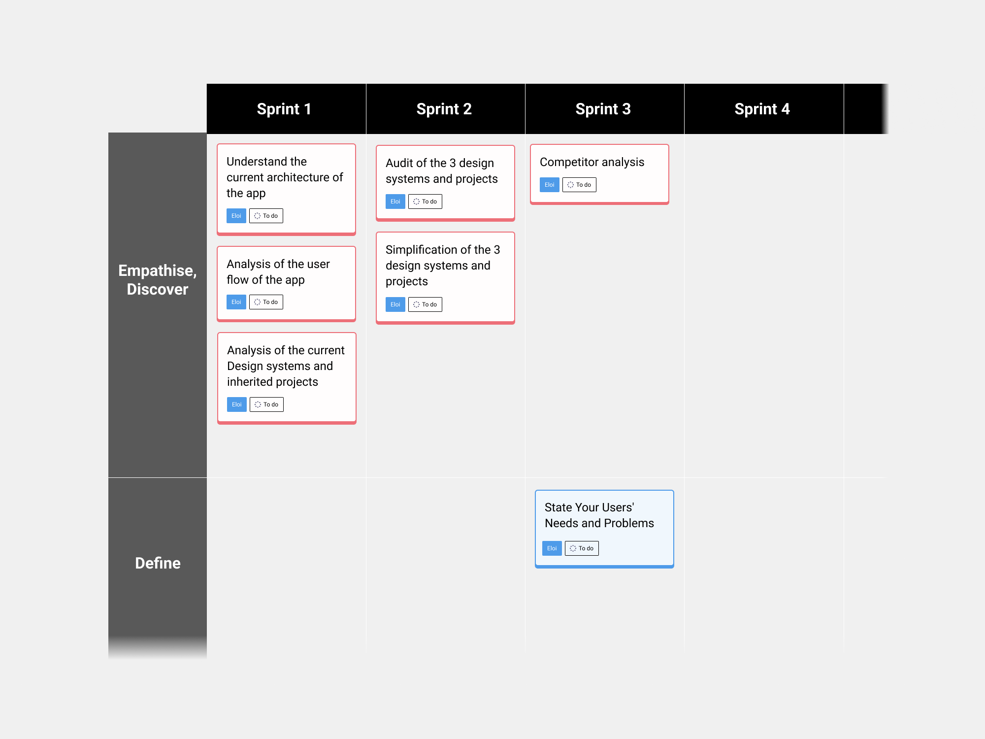
✅ Empathise
• I started to break down and analyse the information architecture and user flow of the current app.
This is an example of how we could speed up the process to create the User flow chart of Priority Pass app with GenAI. It took me 3 min to create the user flow and review it. So, using Figjam AI, I prompted, “ Create a user flow chat of the Priority Pass app”

• Analysis: We inherited six projects (3 brands × 2 platforms) linked to three Compass Design Systems (CDS), creating time-consuming challenges for design and tech teams. The lack of a scalable design system meant designing for six projects, building components for three brands, and repeatedly uploading them to Zeplin—an inefficient and unsustainable process for business, engineering, and design.

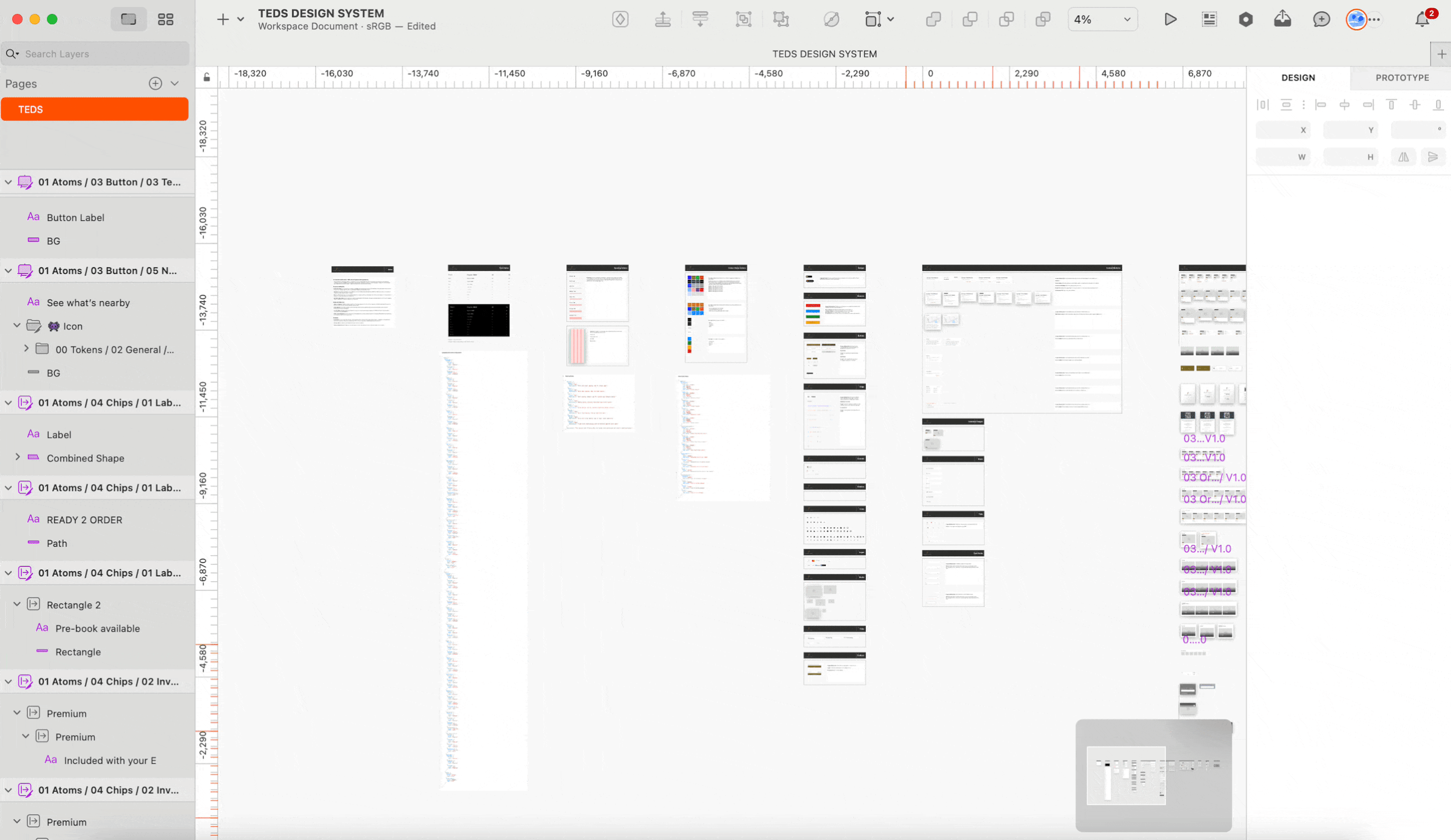
• Audit: To streamline the process, I audited components across all three brands and consolidated them into a single set within TEDS (Travel Experience Design System). Using atomic design principles, we ensured modularity, scalability, and consistency, allowing efficient management and updates. Inspired by Google Material Design, we tailored the system for responsiveness, accessibility, and optimal speed.

A simplified depiction of the audit and future structural approach involved consolidating all components repeat it x3, one for each brand, into a single component per brand. The strategy included swapping colour variables and text styles for a more streamlined approach.


After completing the AUDIT and gaining a thorough understanding of the architecture and structure for the new TEDS, I moved on to conduct an analysis of our competitors.
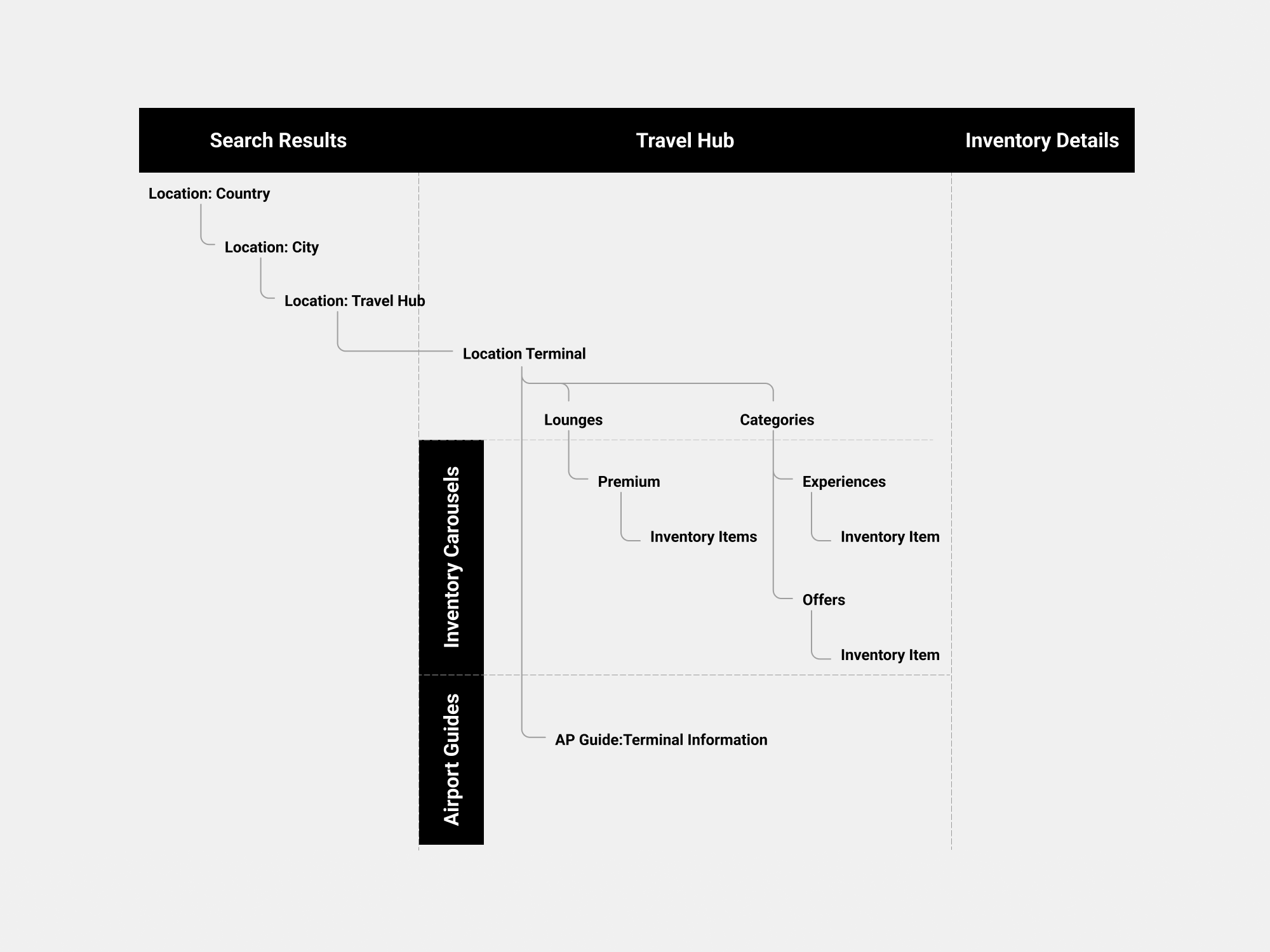
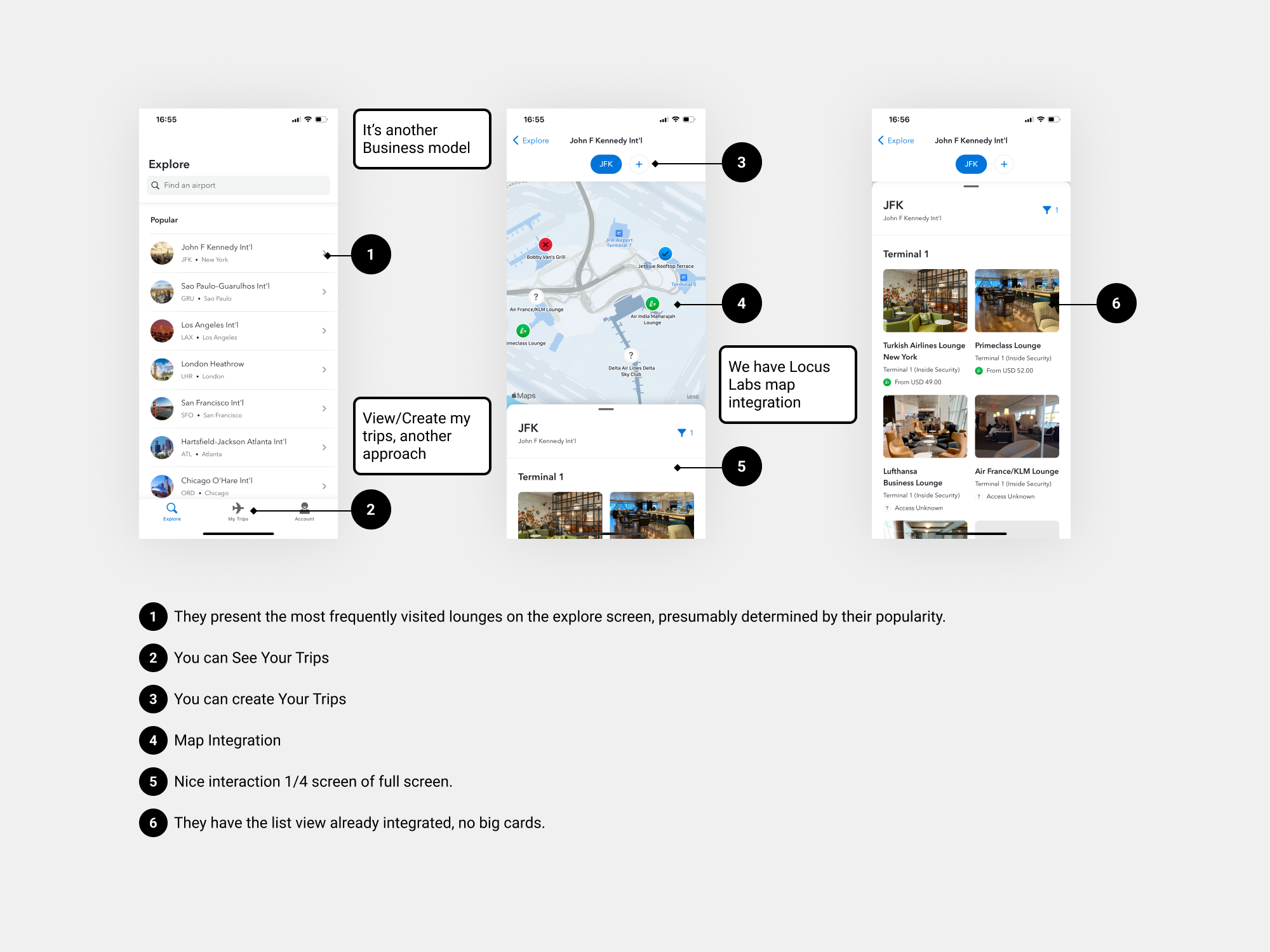
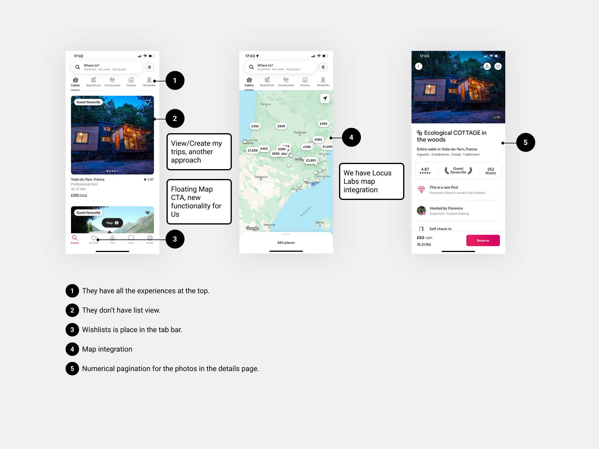
• Competitor analysis: I carried out competitor research on our main competitors, focused on the inventory sections. While we didn't alter the functionality, I aimed to investigate how competitors position and organise key components, assess the user-friendliness of their experiences, and examine the information architecture of their main screens.
Dragon Pass app

Lounge Buddy app.
Airbnb
✅ Define
User: Priority Pass, Lounge Key and MasterCard Airport Experiences consumers, Wholesale and Retail.
Needs: Consumers to go through the experience with no disruption due to a single code base, and implementation of new components across the 3 brands.
Insights: Maintaining three distinct codes for three different brands (PP, LK, and MCAE) was deemed unsustainable from a business, design, and engineering perspective. Consequently, the decision was made to transition to a unified codebase (PP).
✅ Ideate
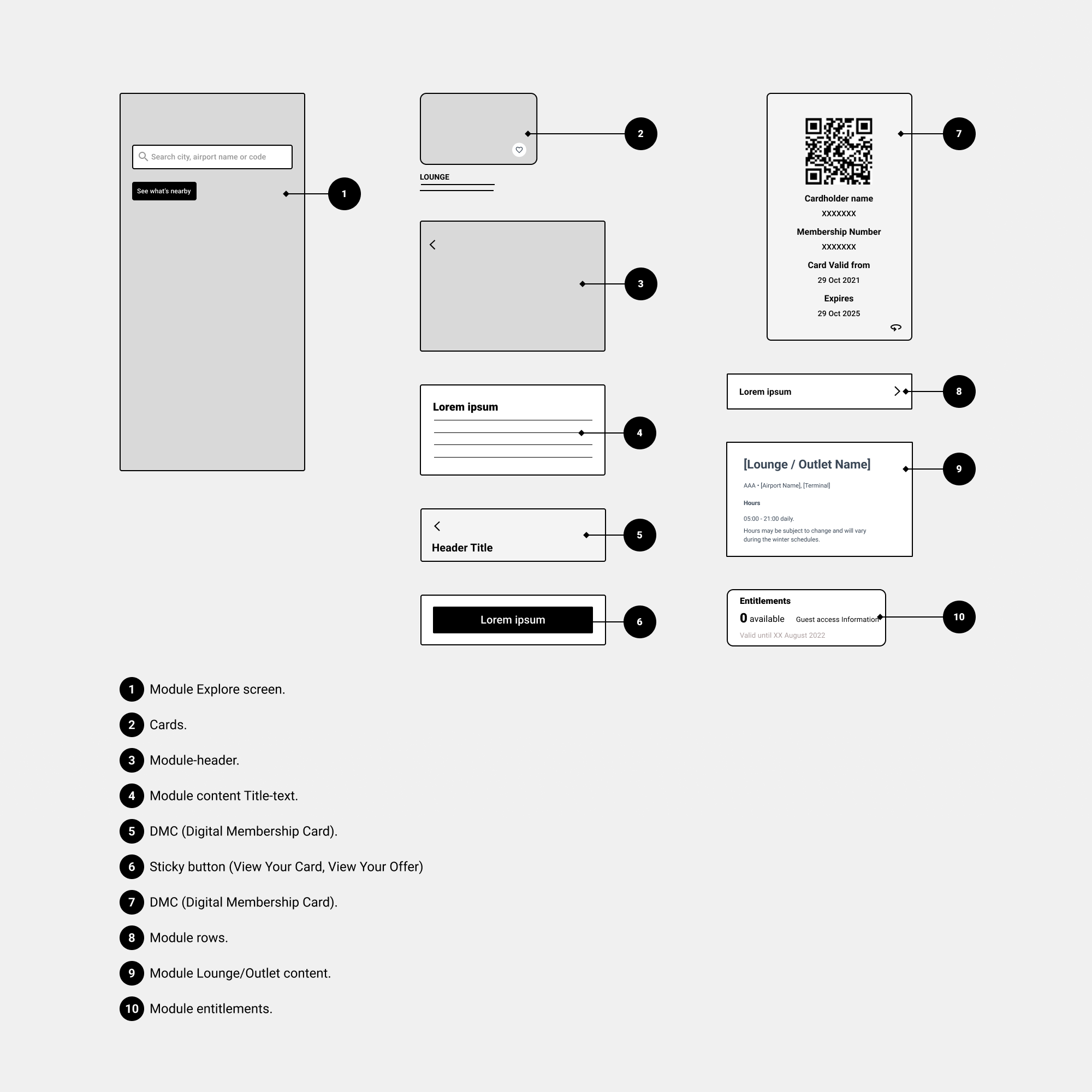
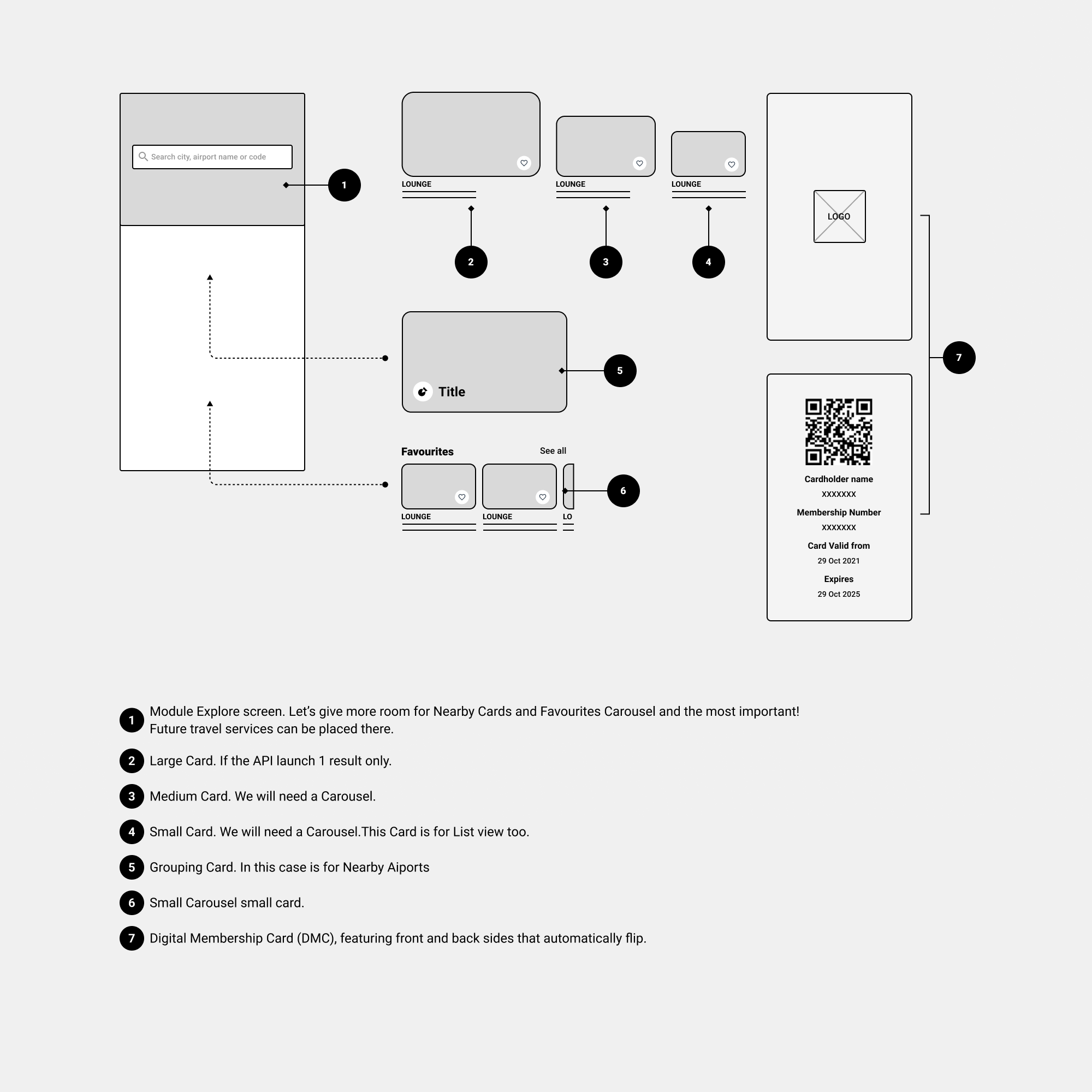
Since we didn’t alter the user flow concerning the old version of the app, I approached this in the following manner: Let's start sketching modular components for scalability, flexibility, ease of maintenance, and reusability, and let's start gathering feedback. We should consider to enable “Nearby Airports” API for the 3 brands. I will focus mainly on the Explore screen, Cards and DMC, since the rest are standard components.
Iteration 1
-
• We need to consider "Favourites". Previously located in the "More" screen, we should now assess user response to having favourites integrated into the Explore screen.
• A card is required for when the user taps on "See What’s Nearby" to view nearby airports. Reevaluate the Explore screen, incorporating both Favourites and "See What's Nearby".
• Let's explore different card sizes. We'll require a list view, where cards are typically smaller.
• While module entitlements appear promising, we will retain the old screen for the Account section. We'll revisit this screen in the future for potential improvements.
• We must show the Logo brand in the DMC.
Iteration 2
-
• "The business logic": Display only nearby Airports and Favourites in the Login state.
• Each individual Card size will require a Carousel with Caption variation and text.
• Implementing Grouping Card is an excellent idea; we'll also need a variation with caption and text.
• Marketing feedback, the Brand Logo should be positioned on both sides of the card.
• Remember to add Apple/Google wallet CTA in the DMC.
• I started by outlining, and defining the wireframes-flow, before proceeding to create the components in the design system. This was done to enable stakeholders to provide feedback. Once again, we didn’t include any additional functionality compared to the initial version. The flow is the same.
Please note: The Pre-Book flow is web-based and therefore not included in the scope for redesign. It will remain unchanged. Not all the Lounges have a Pre-Book feature available.

-
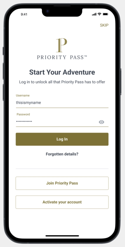
• The onboarding screens for first-time user login will not undergo redesign, as it falls outside the scope of the MVP.
• In addition to the Digital Membership Card, we also have the Offer Card.
• The "Rate my visit" flow is considered out of scope for the current phase.
• Designing a new layout for the Account screen is also out of scope at this time.
• Pagination on Pictures Inventory details.
• Card taxonomy
• Before I started creating the components, I conducted some research on the visual language we intended to use, the styling, and, most importantly, how our users perceive our brand.
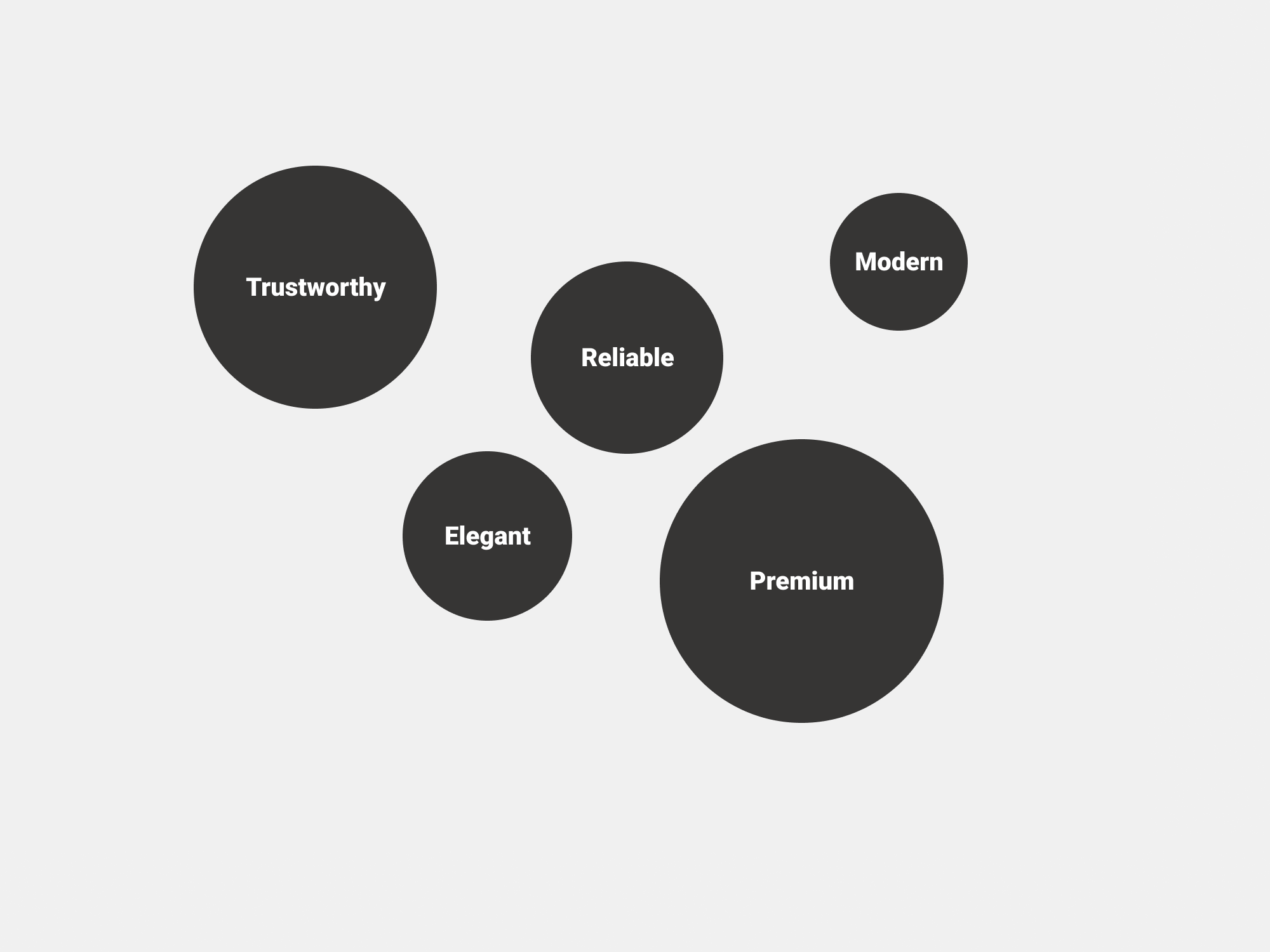
• I created a mood board to capture and communicate the overall aesthetic/feeling that a project or design should evoke. That helped to understand the visual direction and set the tone.

Here there is a sample of the visual language direction...
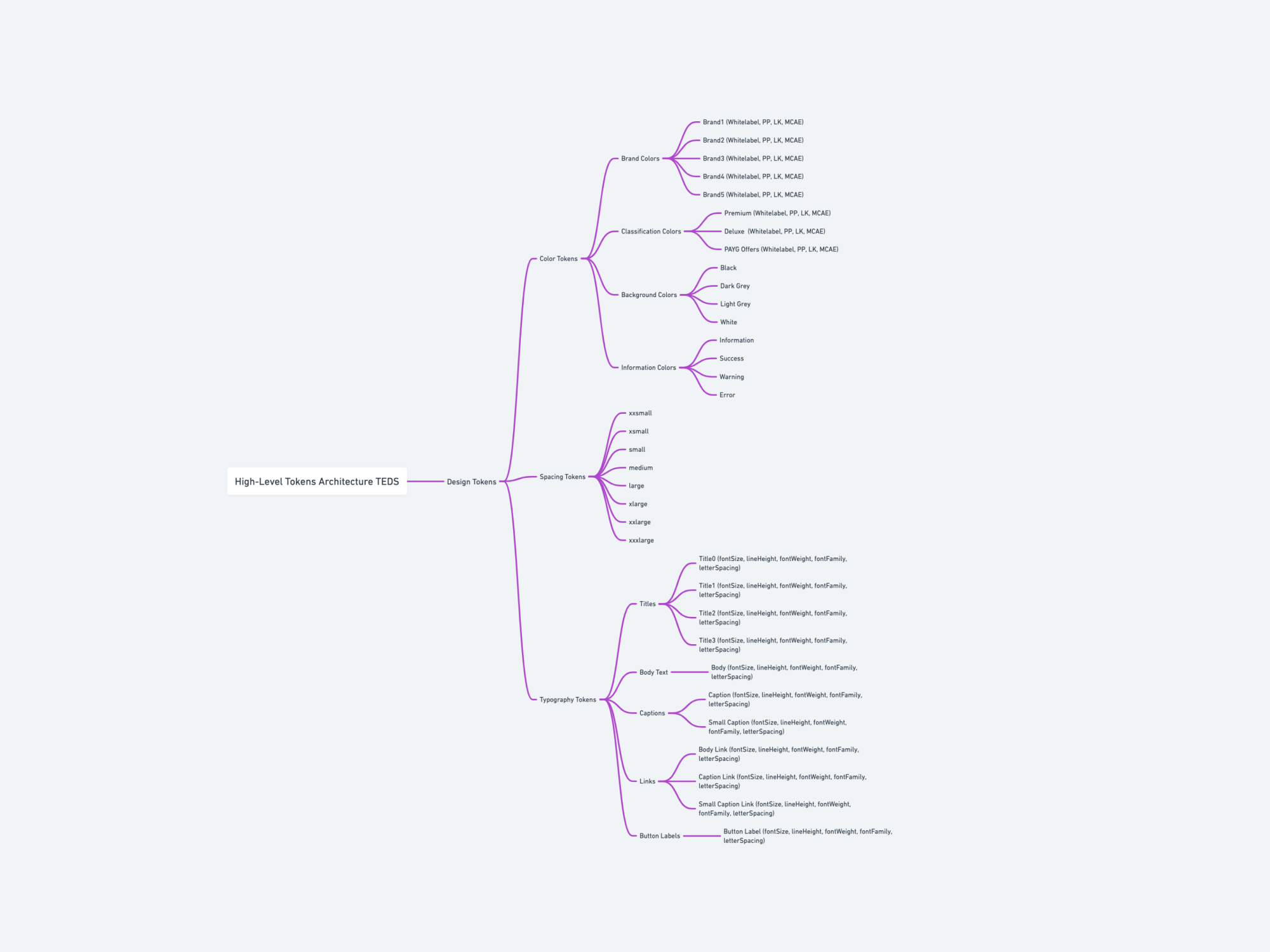
• Tokens architecture: I started mapping out a high-level tokens architecture, which served as the foundation of the design system.
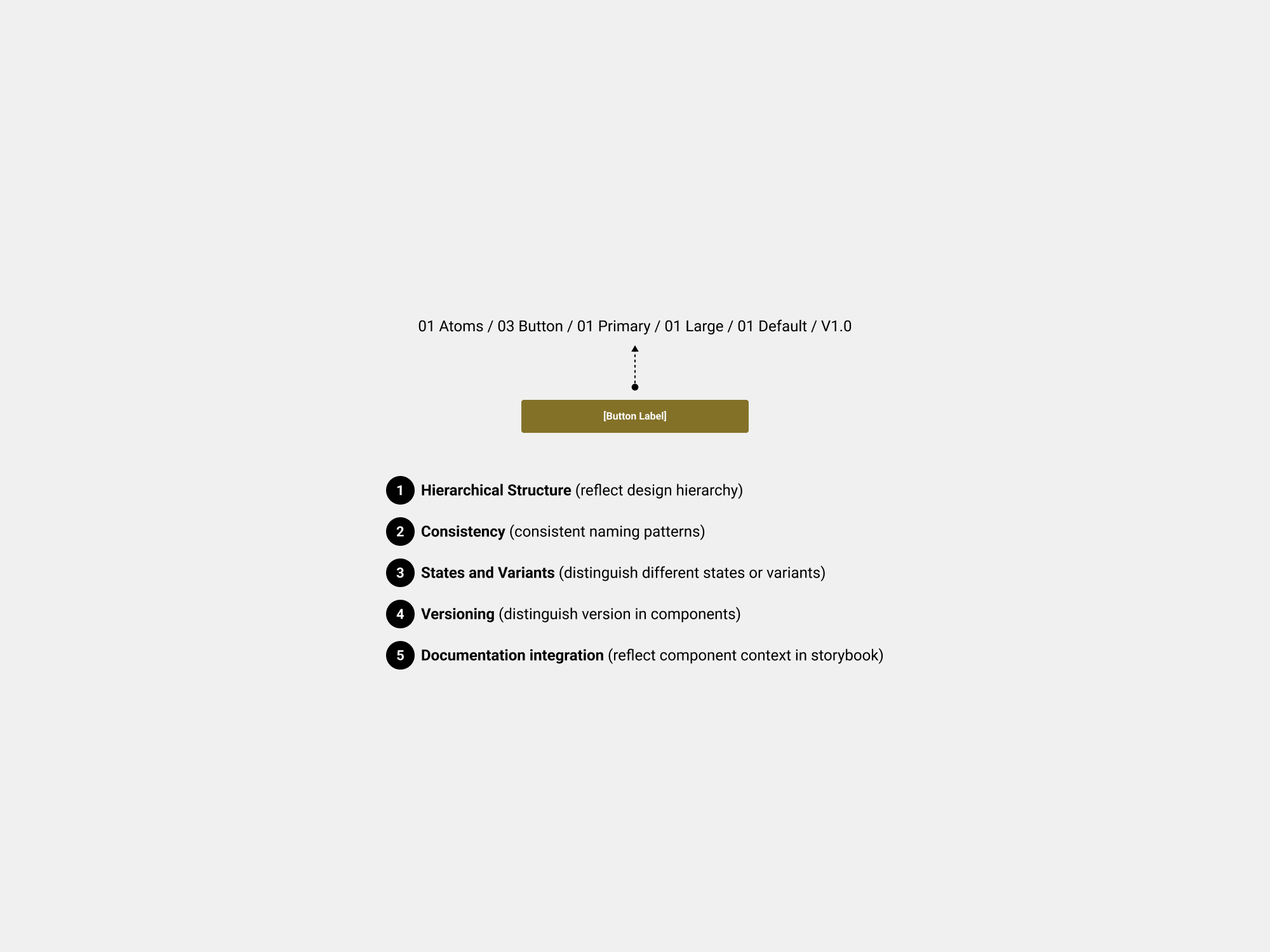
• Naming conventions: To create a scalable, maintainable, and user-friendly design system, it's essential to have a systematic naming convention for components. We worked together with engineers to match this with storybook components naming. So We followed this principles.
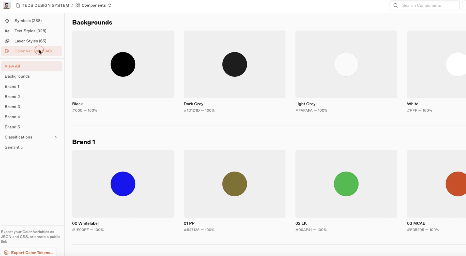
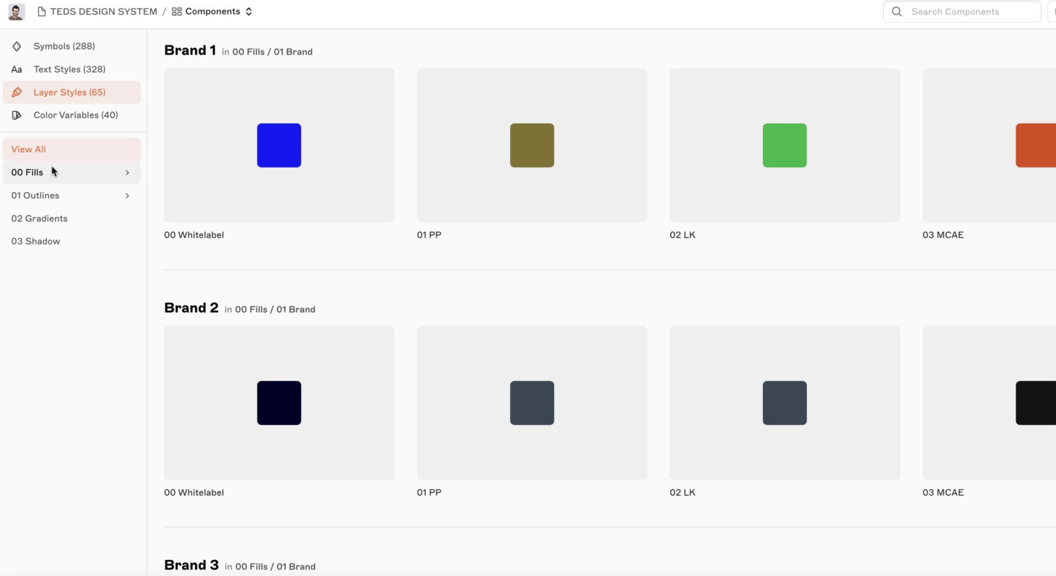
• Colour variables/Tokens: For consistency I decided to use colour variables in the layer styles, in this way we can ensure that our design maintains a consistent colour scheme. This approach ensures that any updates to the hex value of a colour variable are automatically reflected in the layer style as well. To maintain consistency in the code, I exported the structure as a .json file for the engineers.
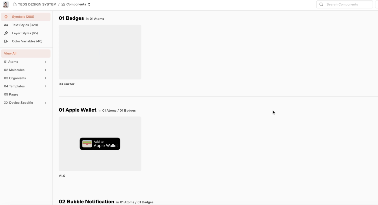
• Components structure in zeplin.
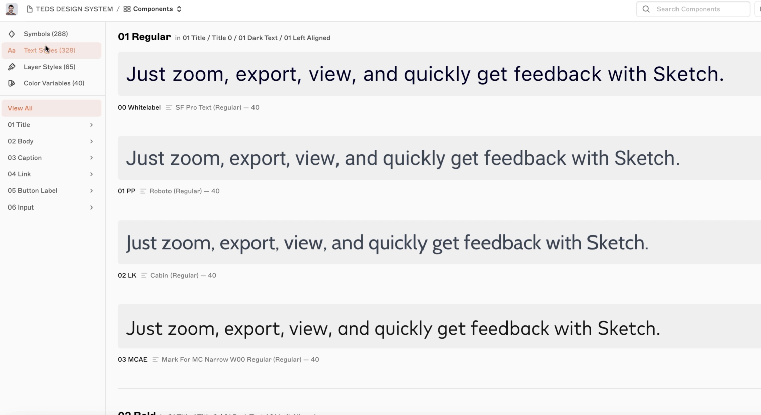
• Text Styles structure in zeplin.
• Layer styles in zeplin.
When I started strategically planning to streamline and simplify the existing complexity and starting the creation of the new Design System, I ensured that we addressed key considerations. This involved prioritising consistency, efficiency, and scalability in both design and development efforts. Here are the key considerations to take into account before embarking on the creation of a Design System.

I built the Design System with another designer, ensuring cross-platform consistency for efficiency. Flexibility was key in a fast-paced environment with many dependencies. I took a holistic approach, considering future expansions, entitlements, dual language, and web integration.
• Accessibility principles: I adhered to accessibility principles (Perceivable, Operable, Understandable, Robust) but want to highlight key points:
Collinson postponed accessibility efforts until the 2022 Uservision audit.
Dynamic Type was deactivated due to font issues in the Mastercard Airport Travel Experiences brand, maintaining branding at the cost of accessibility.
Some brand colors lacked contrast, requiring brand-level changes beyond our scope but set for audit review.
Screen reader improvements are needed; we don’t fully meet WCAG 2.1 AA yet but aim to address this in the audit.
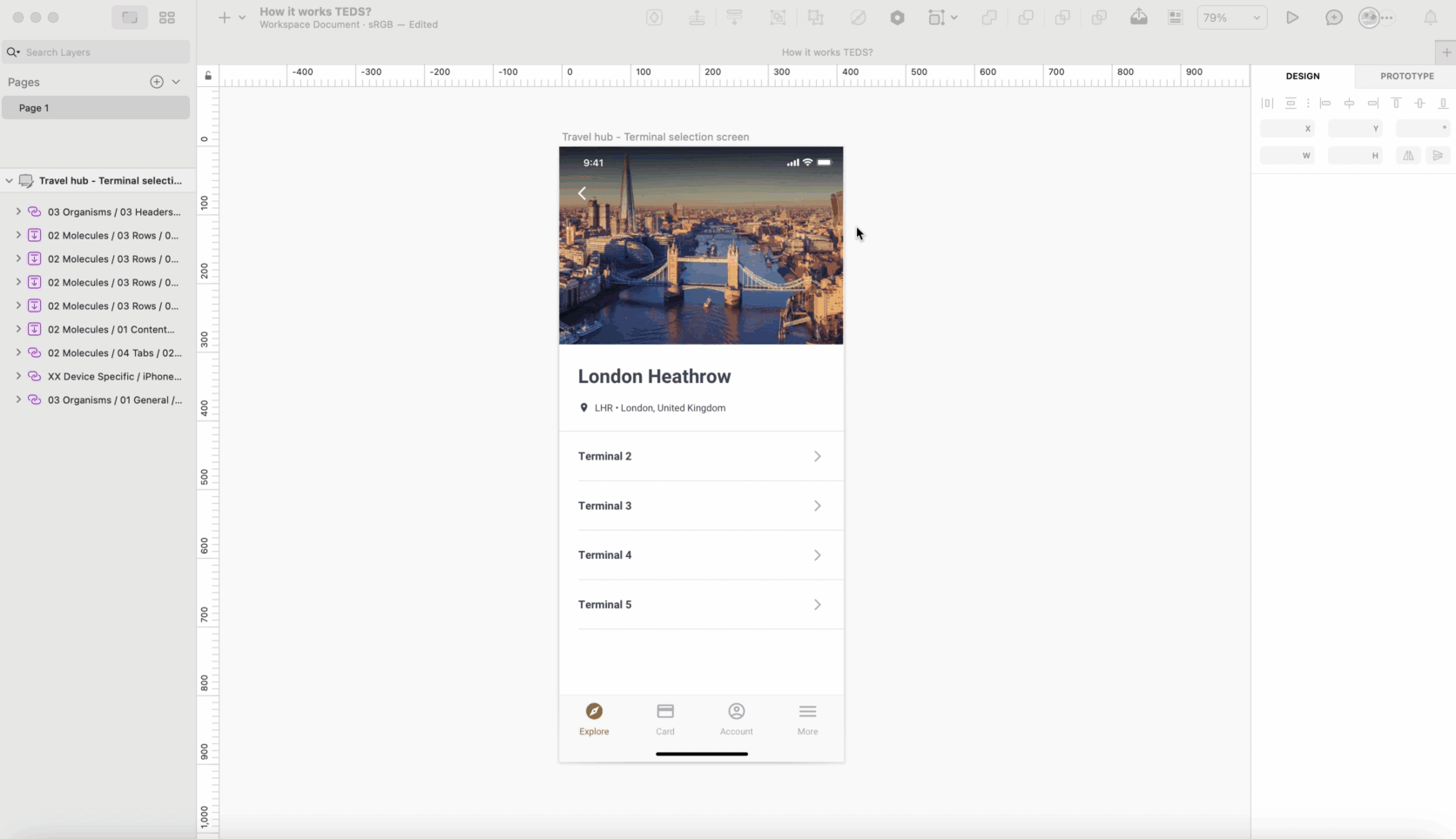
• So, how does it work TEDS? Here's an example demonstrating how to transition a screen from the Priority Pass brand to the Lounge Key brand.
The TEDS Design System unified design and development, streamlining workflows. Within six months, it was fully adopted by engineers and the product team, supporting three brands under one system.
After implementing all components, We conducted a usability test with Userlytics to validate design changes. This ensured alignment with user needs, using a diverse participant pool representative of our target audience. They were asked to perform specific Tasks.
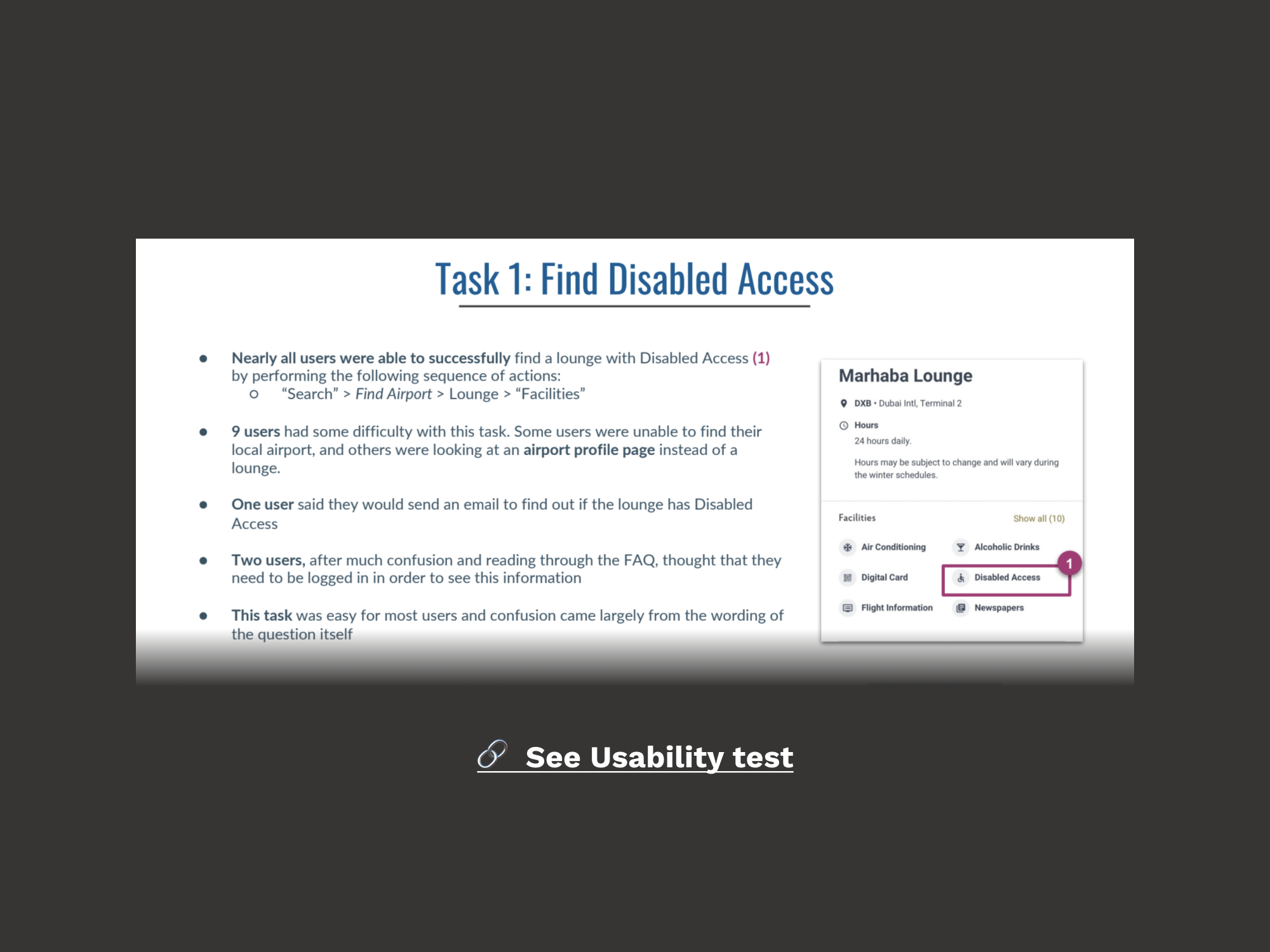
Participants navigated the Priority Pass app effortlessly, providing highly positive feedback. With retention as the core objective, most issues had a Severity B rating (major usability problems, high priority). A new account screen was already in development to address these concerns, allowing us to shift focus toward optimising travel services for growth.
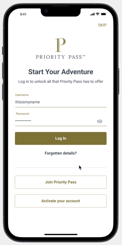
One of our business objectives was to increase registration CVR and boost login session. To address this, I suggested an A/B test. This test involved adding a favourite icon to all inventory items in the logout state. Consequently, favouriting any item would prompt the login screen.
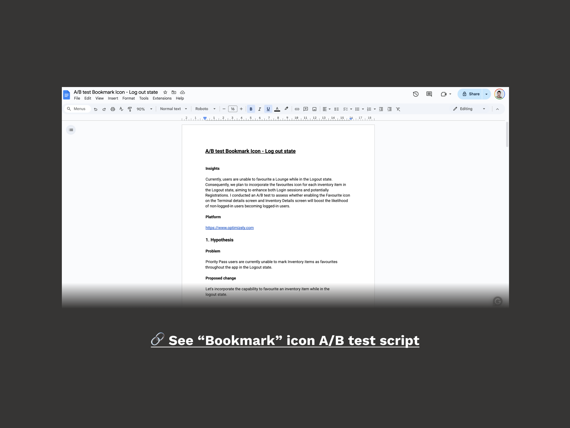
The results of this A/B test were successful, leading to an increase in the conversion rate of registrations and login sessions.
Travel Services - Growth
1. Ready 2 Order: Ready 2 Order launched with Collinson’s partner Grab, the leading airport e-commerce platform.
During the pilot phase, the focus was on app promotion. Users scanned QR codes at lounge tables to access exclusive menus, place orders, and receive service at their table. Initially available in select lounges, I designed the top-of-funnel journey, collaborating with marketing to refine messaging and visuals, ensuring clarity and enhancing the value proposition.
1.1 End Points affected - Business Logic
We had the onboarding screens, which still retained old tokens and styles as they weren't initially included in the MVP scope. However, to highlight the new R20 feature, I developed a tokenised template within the Design System for all onboarding screens. The logic behind it was:
1.1.1 Upon the user's initial login, display the onboarding screens.
1.1.2 For returned users, show R2O onboarding screen.
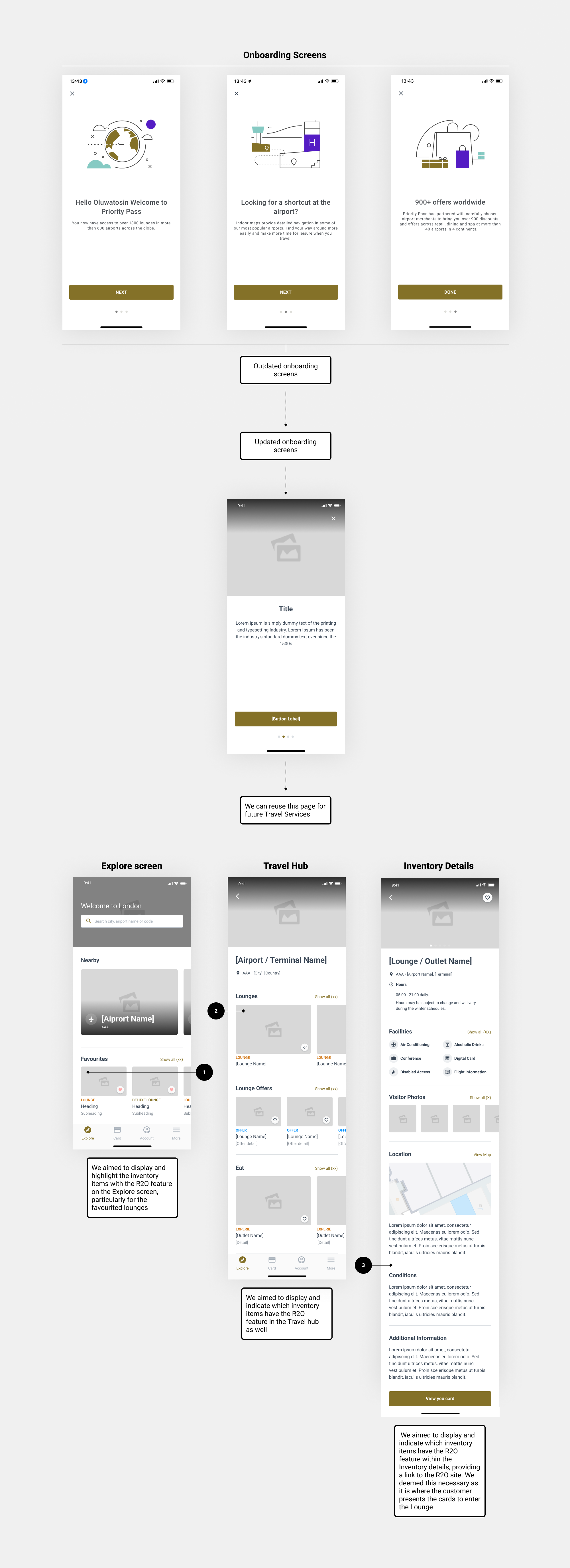
1.2 Analysis
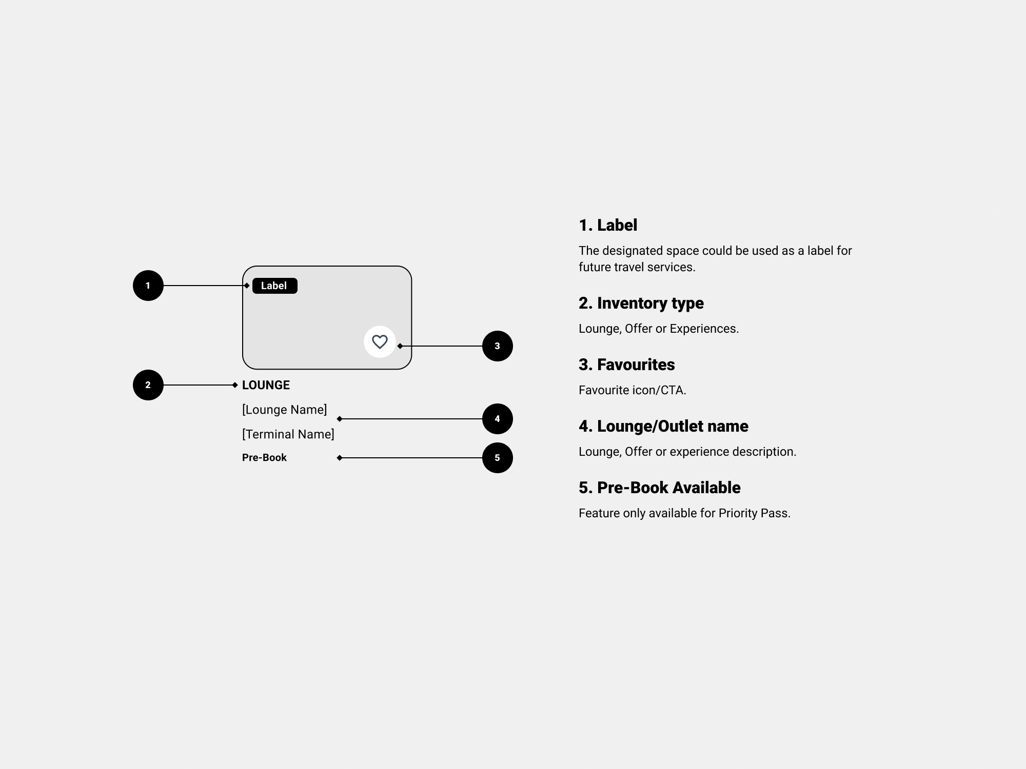
The initial action was to showcase the product within the app. Each individual card representing an inventory item included a variation with a corresponding label (developed during the creation of the Design System). Another components had also a variation to integrate this label across the different end-points.

1.3 Prototype
As a business, we believed the placement of this feature is quite straightforward. Therefore, there's no need to conduct any testing here. Let's simply track the data and observe the number of orders from various lounges over the next six months.
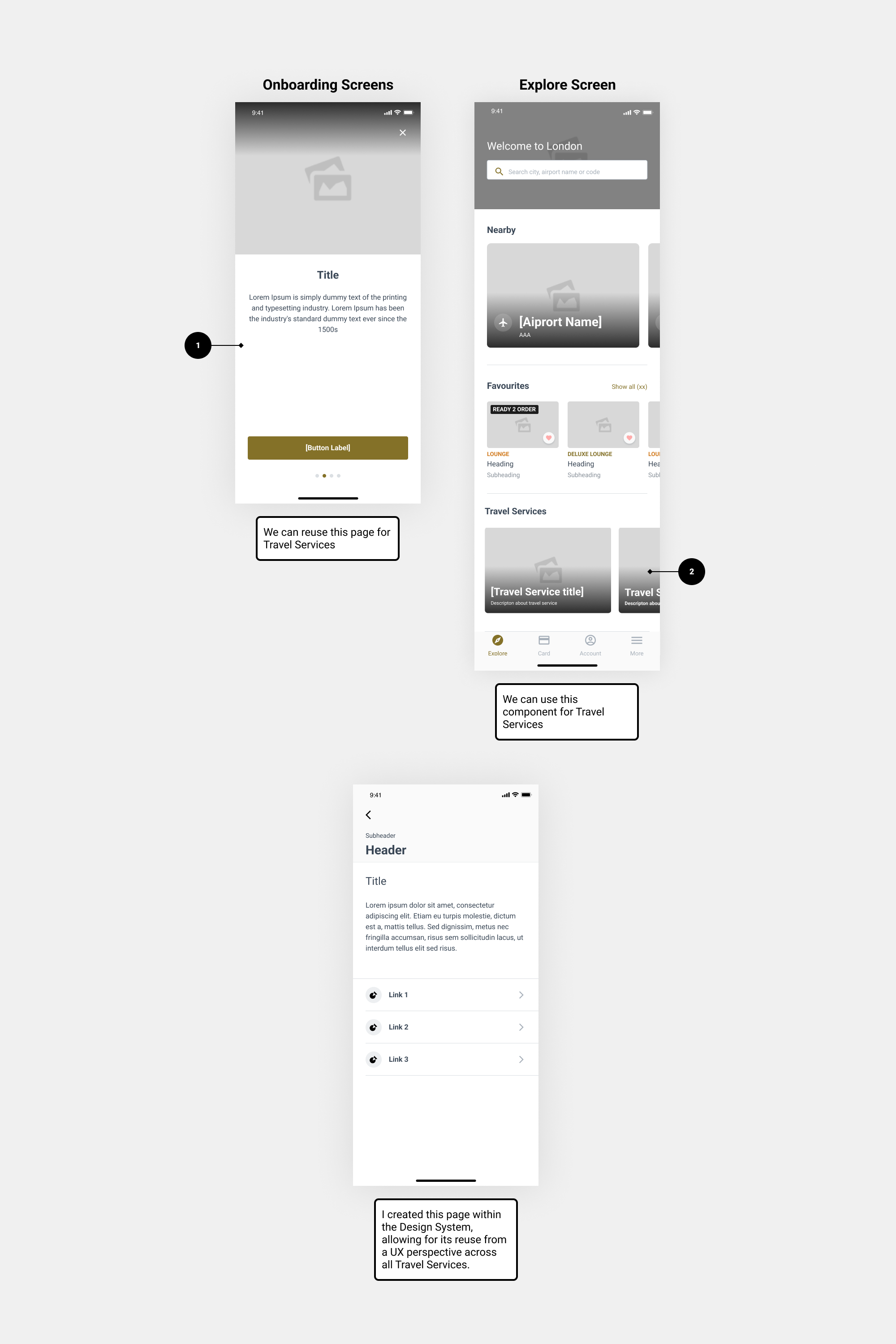
2. Covid -19: Collinson launched the UK’s first pre-departure rapid LAMP COVID-19 testing at Heathrow, with more locations quickly following. Since 75% of users used the app over the website, we integrated the experience in-app. Leveraging our partnerships with travel service providers like Airport Transfer, Car Rental, and Duty-Free Shopping, I took a holistic approach to incorporating these services. With all components already designed, implemented, and tested, the solution was straightforward.
2.1 End Points - Business logic
I reused the template for the onboarding screens
2.1.1 Upon the user's initial login, display the onboarding screens.
2.1.2 For returned users (second time), show the travel services onboarding screens.
2.2 Prototype
Lessons Learned
In the course of our app white label project, several valuable lessons were gleaned, contributing to a more comprehensive understanding of the process and enhancing our approach for future endeavours.
• Establishing clear communication channels and ensuring all stakeholders are aligned from the project's initiation is paramount. Regular updates and transparent communication help mitigate misunderstandings and align expectations.
• Building flexibility into project timelines is crucial. Unforeseen challenges and delays are inevitable, and having a contingency plan ensures smoother project management.
• Thorough and continuous documentation is an ongoing process. Keeping detailed records throughout the project lifecycle facilitates seamless knowledge transfer, aiding future maintenance and updates.