🚀 My Impact
Key business impacts include:
• Long-term Forecaster, Scheduler and Capacity-Planning Infrastructure and functionality.
MVP:
• New Concept validated: Improved forecasting through the Continuous Forecast concept.
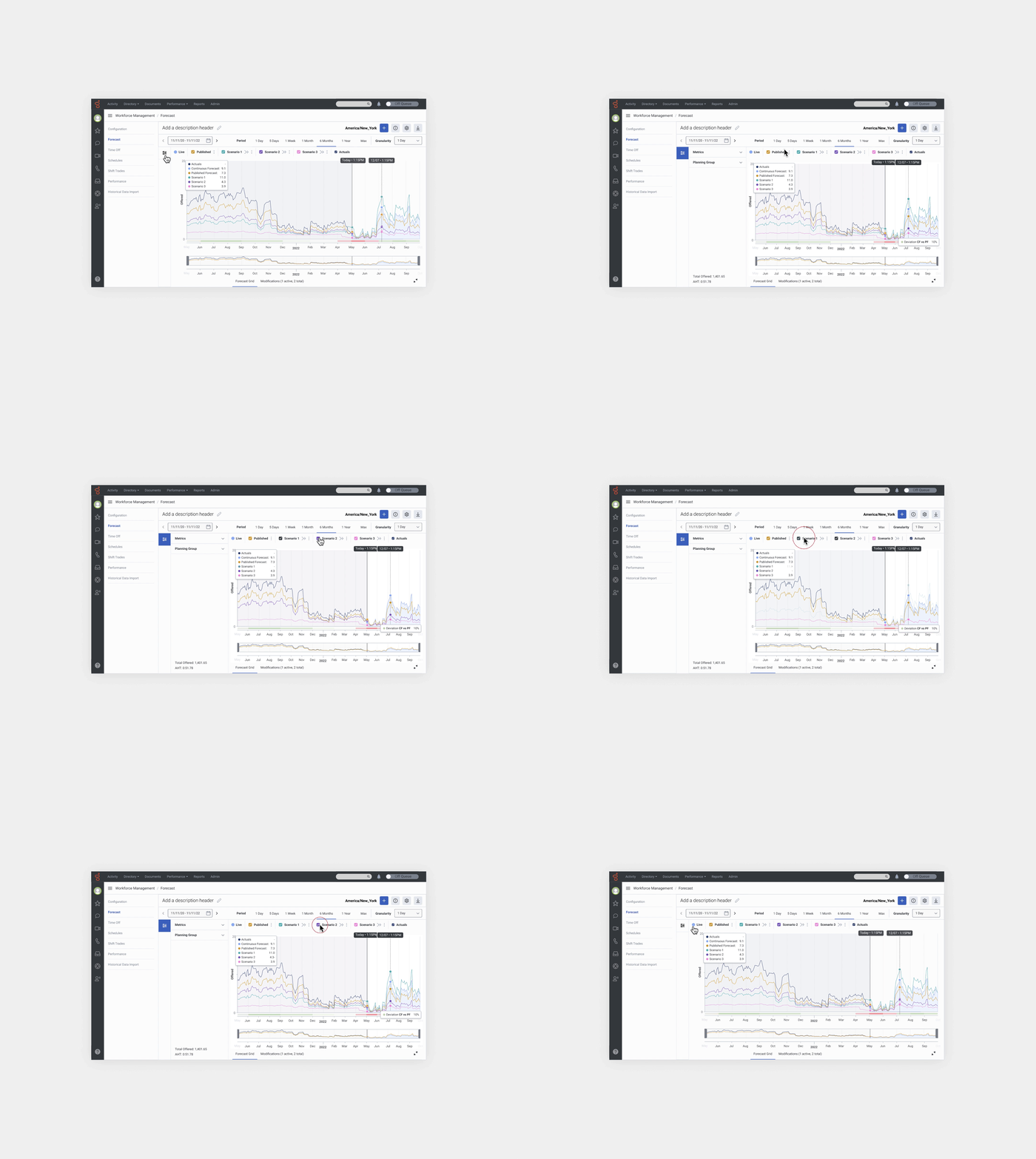
• Enhanced visibility and understanding of the the main view, with the Continuous, and Published forecasts.
• "What if" scenario creation and modifiable comparisons.
• Main view improvements: rearrangement controls, chart visibility, and data visualization.
• UI reskin of main components of the list and main view in line with the Spark Design System.
Background
Established in 1990, Genesys is a U.S. software company specialising in customer experience and call centre technology for mid-sized and large businesses. Applied Works has collaborated with Genesys for nearly eight years. This project involves partnering with the Workforce Management (WFM) team to develop and implement a novel concept, "Continuous Forecast," from scratch (0-1) on its existing platform. Leveraging AI and machine learning, this concept simulates potential future scenarios, enabling users to assess the impact of variable changes on call centre forecasts and offering valuable insights for proactive planning.
The Challenge
Forecasters, Schedulers and Capacity planners of the call Centres didn’t have a platform to make more accurate predictions. Genesys and Applied Works aimed to solidify a vision for implementing a Forecasting, Scheduling (and Capacity Planning) experience into Genesys Cloud over the next few years. This process included delivering a MVP in the short term while building out the vision in the long-term.
Role
Senior Freelance Product Designer.
Alongside the Design Lead and the Genesys Project Manager, We led the new concept validation, MVP, and long-term vision from scratch.
• Product Designer
• User Experience (UX) Designer
• User Interface (UI) Designer
• Visual Designer
Deliverables
These are all the deliverables:
• UX strategy
• Analysis of the current platform
• Interviews
• User Personas
• Competitor analysis
• Workshop User stories/MVP
• Infrastructure blueprint
• Iterative prototypes
• Concept Validation Usability test
• Audit the current forecast section
• New data visualisation
• Creation of the components of the Design System
• Documentation
Tools
Figma, Chat GPT, Miro, Jira, Excel, pen and paper.
Final UI
Overall, the layout and the main UI endpoints are more aligned with the Spark Design System, and there is a improvement of the main view and the chart data visualisation.
#UX Strategy
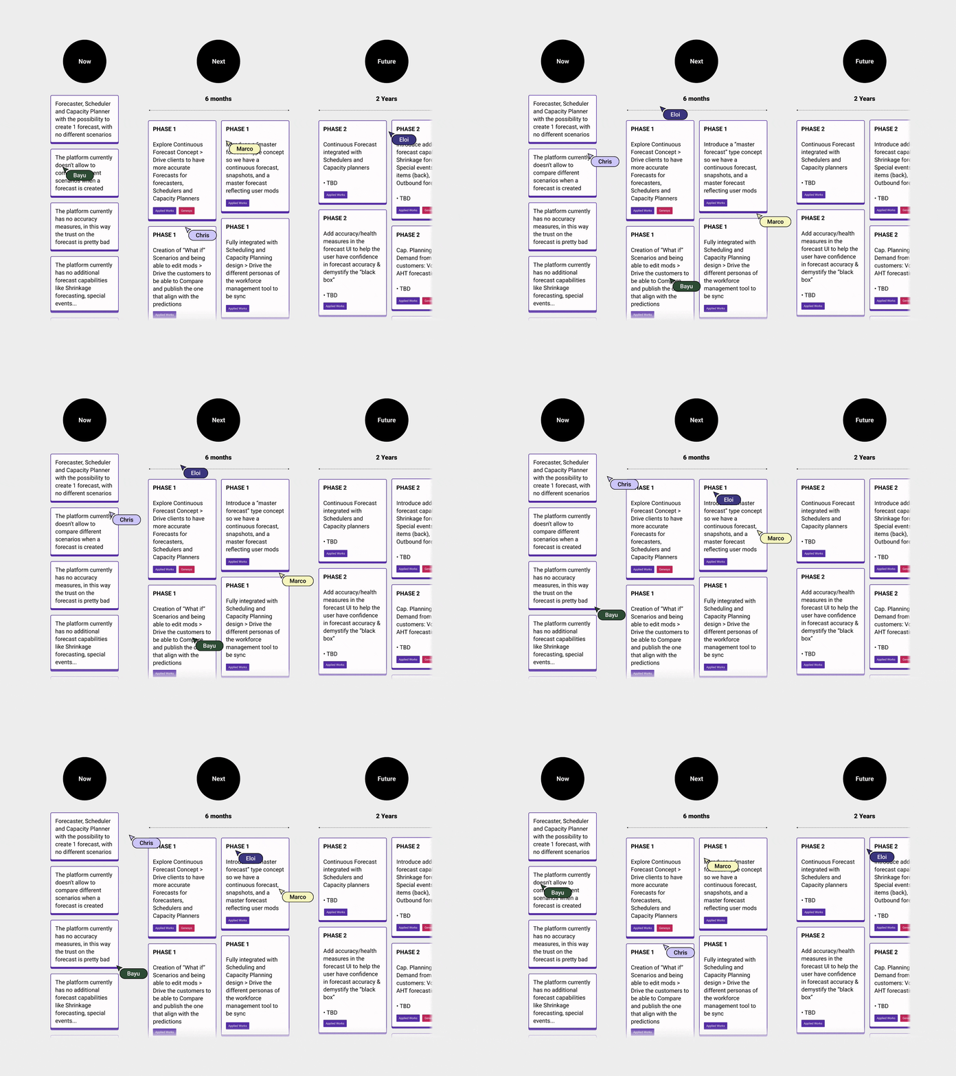
The Design lead and I worked closely with key Genesys stakeholders to understand the Vision, Business, and User Goals. Genesys emphasised the User Goals for the next six months since they had already done some research. We crafted a more precise plan by establishing a UX strategy for the Continuous Forecast concept validation project. We mapped out a tactical and strategic vision for the next six months to two years through an exercise with Genesys. The Lead designer and I outlined all the actions to achieve the goals in the UX Roadmap mapping workshop. Nevertheless, the project's complexity may modify the plan as we navigate uncertainties with this innovative concept.
We focused on the next 6 months…
✅ Empathise
• UI mapping: Firstly, I started to map out the main UI part of the Forecast section.
• Initial Questions: Secondly, I asked some basic but necessary questions to understand the basics and new concept definitions.
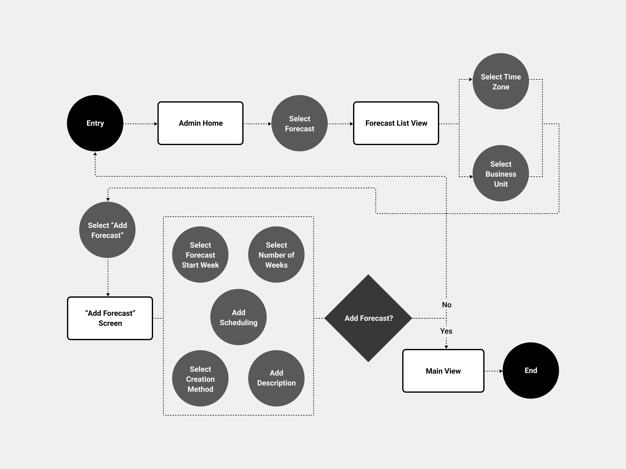
• Forecast User Flow: Understanding how a forecaster Creates a forecast was essential to grasp how he behaves with the platform.
• Interviews: We interviewed 7 participants, a Mix of Genesys and non-Genesys customers, Forecasters, Planners, Performance Managers, and Schedulers from different industries: Finance, IT, Utilities, Education Management, Design, and Healthcare.
• User Personas: From all the information gathered in the Interviews and some data that Genesys had from previous years, We identified some patterns, so, We created the UX personas
• Miro assist AI : Although Miro hadn't implemented "Miro assist" AI at that time, I leave an example of how the clustering by tag and Summarise feature could help speed up the process.
• Competitor Analysis: Our main Competitor was Amazon Connect, so Genesys wanted to focus only on this competitor. I went through it in detail to break down the main functionalities…
✅ Define
User: Forecaster ( Phase 1). That said, We need to plan and take into account Schedulers and Cap. Planners too.
Needs: Creation of the forecast from the continuous forecast, having a view of the Continuous Forecast stream of data along the published forecast and “Scenarios”, what-if scenarios and the ability to modify them.
Insights: Users are frustrated with not having the possibility to create What-if scenarios and compare them, maintaining data accuracy is an ongoing pain, and the current forecasting predictions, unfortunately, fall short of the desired accuracy level, and inconsistencies in data synchronisation across user personas.
✅ Ideate
• Epics: The Initiative is to “Build and create a Continuous forecast” encompassing the Forecasters, Schedulers and Cap. Planners. So, the epics related to this significant Initiative are the ones below. Although Phase 1 is just for the Forecaster, We need to see the impact on the Schedulers and planners.
• Q&A Epics: I had many questions about the epics, so We had several meetings with Genesys, as reflected in this Excel sheet .
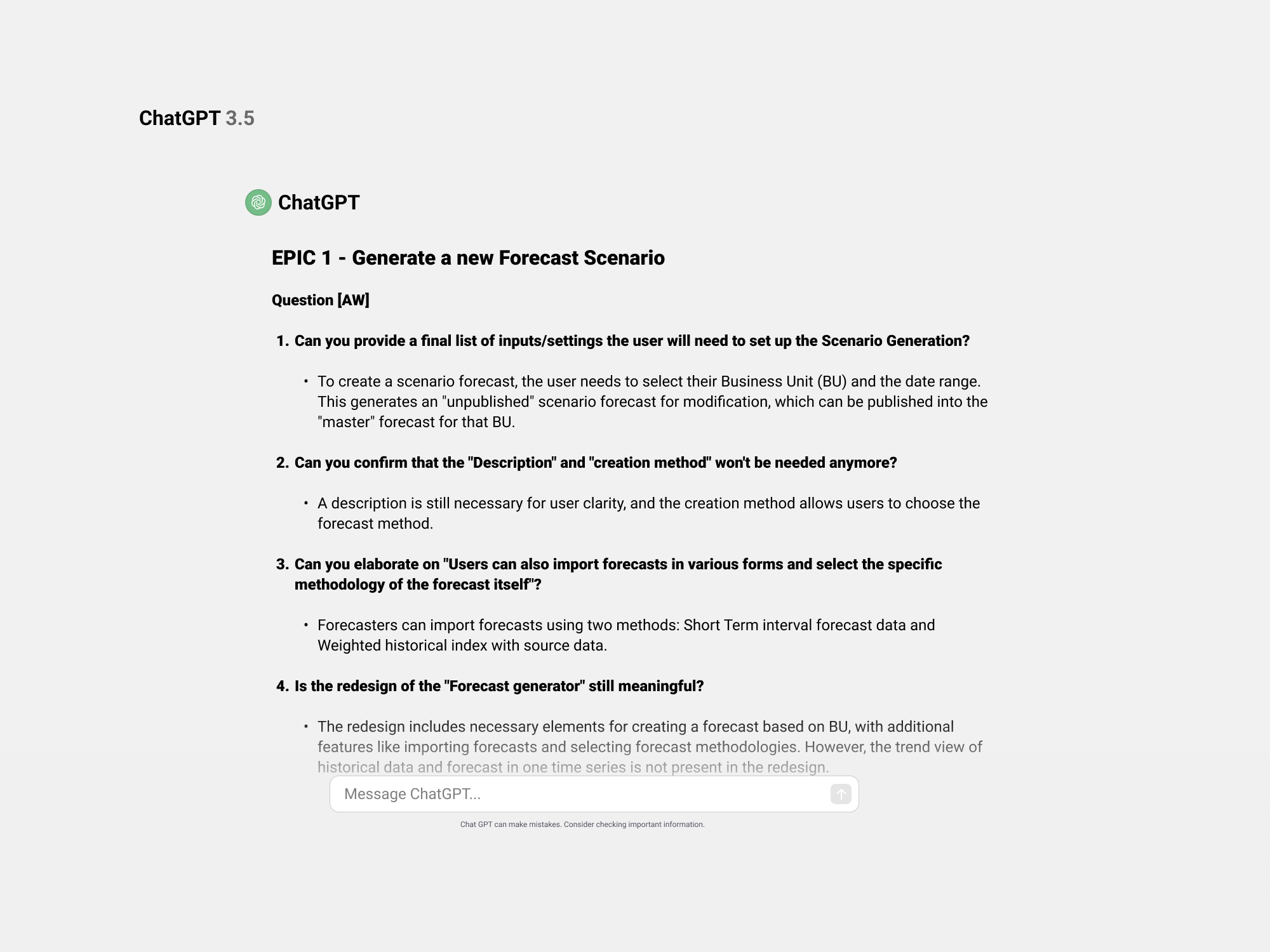
• Chat GPT: Although Chat GPT was not in the market yet, this is an example of How We could automate the awful Excel sheet information and restructure it in a meaningful and thoughtful way (basically copy-paste all the content to Chat GPT) and prompt…
• We started to create the user stories from the epics, I workshoped that with Genesys, since this was long and complex.
• We workshoped too the MVP once I created the user stories.
Genesys pushed for more UX features for the MVP, although realistically, What We workshoped was more than enough since We didn’t even start to validate the concept… In parallel I started to make the blueprint/Infrastructure for long-term vision…taking into account Schedulers and Capacity Planners…
• Mapping Main Areas: I first proposed rearranging some UI elements to start the wireframes since the grouping was not intuitive enough.
• Initial Wireframes: Baseline Initial concept.
✅ Prototype
We asked Genesys to generate a real use case where We could test all the assumptions; otherwise, it would be more challenging to have a tangible impact on what We tried to achieve.
-
• Genesys will explore WHI integration when creating a scenario.
• Explore the possibility of “unpublish” a scenario.
• When You publish a scenario, the Continuous forecast it shouldn't disappear, it’s always visible (on/off)
• The continuous forecast concept is from today onwards + 2 years out, so what happens with the last period when you create a scenario today? (Historical published) Genesys will take it offline.
• When the user creates a Scenario from the Continuous forecast, that should be the same stream as CF since it takes it from there.
• “Actuals” streamline should be previous to “Today” since it’s the past.
• The "synch" is unclear when a planning group is changed.
✅ Concept Validation Test
• User Testing - Concept Validation
Alongside the lead designer and the researcher, I created a plan to test the concept and validate its main aspects.
-
• We don’t need to add the Business Unit and the time zone every time; this is something that Forecaster barely touches.
• We can go directly from the “Forecast” section in admin and have the Continuous and published forecasts in the main view.
• In the beginning, the Continuous and published forecasts are the same.
• We should consider naming it “Live Forecast” instead of Continuous Forecast.
• Let’s add all the creation methods we already have in the platform, but let’s prioritise creating from “Streaming Continuous forecast.”
• If there are mods, it is when the Published forecast differs from the Continuous forecast.
• We need an effective publish date since I may want to wait to publish the scenario.
-
• ABM is the same as Continuous Forecast since the system will choose the best based on historical data.
• I would frame the Continuous Forecast to 2 years Out from the day created, Instead of “Infinite”.
• You can’t create a Scenario from the Published Forecast.
• The concept is now clear, and the main view is understandable.
• Published and continuous are two streams that forecasters understand how to use.
• The synch and re-publish when there is a change in the PGs is clear.
• Users can see in the main view up to 3 scenarios modified and compare them.
• The overriding concept is now clear.
• Let’s park the “See all scenarios” flow and section. This is a new functionality.
✅ Roadmap Reassessment
• What Applied works will deliver in this 6-month contract?
Since We spent so much time doing research, 1 Month previous to the contract deadline, Genesys and Applied Works worked on What We had to deliver since we had a budget for these six months, Genesys was keen to push for more UX features like Forecast Health, Business Drivers, Accuracy Metrics…so We gave them two options:
-
UX and introduce new features - Introduce Scenario Comparison, Continuous Forecast, Published Forecast & Scenario Forecast Synchronisations, Forecast Health, Business Drivers, Accuracy Metrics.
• Prioritise features to develop.
• UI design of new components only for priority feature.
• Development of new feature in ALPHA (UI not final - as will include both existing + new UI components).
• ALPHA tested with a research group (via Genesys team, rather than public release).
• Iterate.
• Polish final UI - existing components updated in line with Spark Design system.
• UI design of new components for the next priority feature.
• Public release of new feature.
Pros: We’ll be delivering new, helpful features, making advancements to compete with new Amazon product, efficient use of budget, UX strengths AW.
Cons: Features will take longer to reach public release than option 2.
-
Reskin current forecasting UI + Introduce Continuous Forecast, Published Forecast, Scenarios comparison into the current flow & new data visualisation.
• Audit of current forecasting (to capture all components).
• Scenario comparison UX
• UI design of all components & new data visualisations of Forecast section (The grid is excluded for this first release).
• Phased delivery of reskinned current UI designs + new scenario comparison & data viz to Gen team for feedback & iterations.
• Documentation of the new components in relation with Spark Design system.
• Genesys engineering teams apply new UI, Continuous Forecast, Published Forecast, Scenarios comparison and data visualisation.
• Testing of new UI (out of the current budget, Genesys internal team will do that).
• Iterations on testing (out of the current budget, Genesys internal team will do that).
Pros: Faster to public release than developing new features.
Cons: Limited new features.
Genesys and Applied Works reached an agreement with Option 2, as it presented a more feasible step forward from both design and engineering standpoints.
✅ Visuals
Upon completing iterations on the prototypes, we were prepared to initiate the development of visuals for the forecast sections and continue the iterative process. We conduct an audit of both the Forecast List View and the Forecast Main View to understand all the functionalities and identify potential changes. Due to time constraints, Applied Works allocated two additional designers to help us deliver Option 2.
Genesys had an in-house design system team that developed a Design System featuring a more modern aesthetic than the current platform. So, we started to iterate on the two main parts we needed to reskin: tabs and the Forecast Main View. Once we iterated on that, we worked and iterated on the data visualisation and how to integrate it into the main view.
• Tabs: We initiated the exploration focusing on the tabs within the main Forecast View, the taxonomy, and the structure, always considering if we could reuse a component from the 'Spark' Design System.
-
After a conversation with the Design System team at Genesys, we concluded that we can't reuse any of the components. Therefore, we will need to have a strategic vision of how it will look with future states like Synch. We need to develop a specific component for this.
• V4 is a promising approach; let's delve deeper into this.
• The 'Publish' icon is confusing; it appears to be a 'Download' icon.
-
• It's positive to see the icons for syncing and publishing, and they can be integrated. However, let's set aside the sync icon for now, as this state is currently beyond the scope.
• We prefer the V1 approach; the icon is distinct, so using this icon for publishing distinguishes its status in comparison to any other action.
• Let's focus on the Data Visualization colours from the Design System.
-
• Good to use the Design System Colour Tokens.
• Let's assess how it functions when we integrate the data visualisation chart. If we have a maximum of three scenarios, along with continuous forecast, published forecast, and actuals, we should be able to distinguish the lines on the chart.
• “Actuals” should be displayed too.
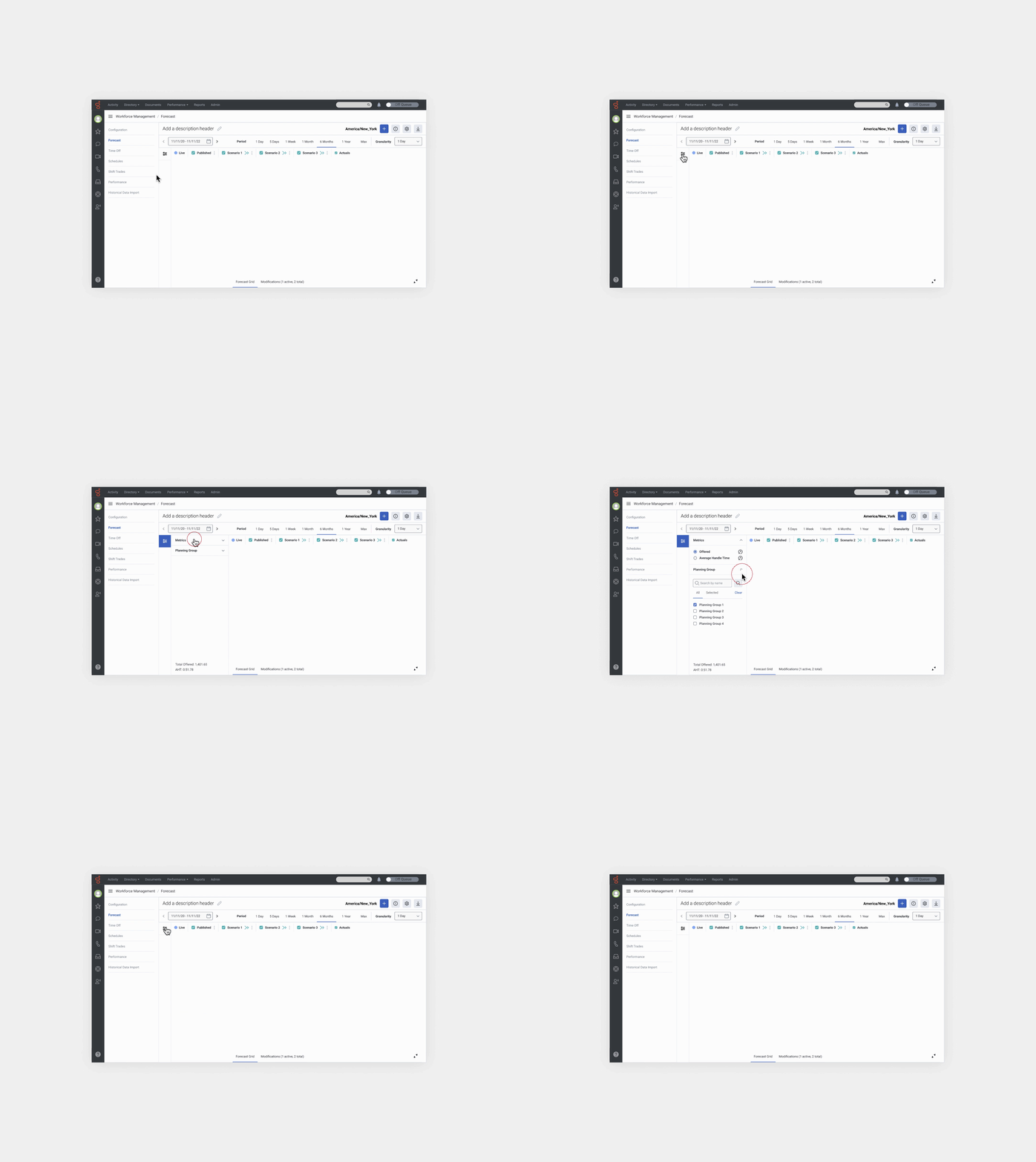
• Forecast Main View: We started with the Forecast Main View. We focused on the metrics panel and all the controls of the chart. And We iterated on this.
-
• "Create a scenario" icon needs to stand out.
• Not sure about the icon on the left of create “Scenario”, meaning?.
• We are missing two icons: Download a Forecast and Forecast Info.
• It Would be great to have the possibility to have complete visibility of the chart, some mechanism to expand and collapse the metrics panel.
-
• The calendar component, as it's been built and implemented, shows only numeric month/day/year.
• The expand and collapse bar is not quite prominent to see, but this is the idea.
• We need room for the title of the Forecast and the ability to edit it too.
• Instead of “CF”, better we name it “Live”.
• Instead of “PF”, We name it “Published”.
-
• The expand and collapse works. We will need to test it though.
• Icons understandable and recognisable and We like the ”edit Title”.
• This is the direction.
• Data Visualisation: The most important thing in this step was to iterate on the data visualisation, but above all, the integration into the Main Forecast View.
-
• The V1 line shape for each stream is a common pattern. We like V2, but it's a leap ahead—too risky.
• We need the “actuals” represented in the chart.
• We have accessibility concerns about Heatmap V2; let's see how the users feel when We test it.
• “Deviation” should be displayed in the chart.
• Let’s place granularity chart at the bottom. Is ho’s how it is today.
• Let’s introduce more Scenarios.
-
• It is better to show Continuous Forecast vs Published Forecast deviation; it’s what the user expects to see.
• The “actuals” look good, but we need a more prominent way to display them. “Actuals” represent historical data, so the forecaster will compare any data with the actuals.
• We don’t need the panel on the right; it’s redundant. The data in each streamline will appear in the panel on the left as the user hovers over the lines.
• The labels on the left are redundant and will be difficult to implement. Having the tabs and the panel is enough to understand the mechanics. That said, we will need to test this part.
• Let’s play around with some secondary colours from the Design System; let’s see some options.
-
• V3 is definitely the one; it's good to have Genesys Blue - #75A8FF as a "Live" color. It represents us!
• The contrast between "live forecast" and published looks good; colours are different, so is good for contrasting and comparing.
• Scenarios feature various color ranges to distinguish between them. It doesn't matter if we introduced a colour that is not part of the secondary palette; the important thing is that they are distinct from each other.
• List of sections to reskin and Documentation: We identified and started to reskin and document all the sections and areas from the Forecast section, according to the “Spark” Design System and Design Tokens. We created new components and delivered them to the Genesys design team to integrate them into the Design system.
Lessons Learned
One of the lessons we learned is that when you start a project from scratch (0-1) and aim to validate a concept while concurrently planning for the MVP, aligning all actions and tasks within each sprint's timeframe becomes challenging. Numerous unknowns and dependencies arise, and even with a well-established UX strategy, constant reassessment becomes necessary. It’s not lineal, and sometimes you have to go back to previous stages and reassess. Given our budget constraints with Genesys, we (Applied Works) would have preferred to conduct usability and accessibility tests with real data, above all, the data visualisation part.


